The Brief
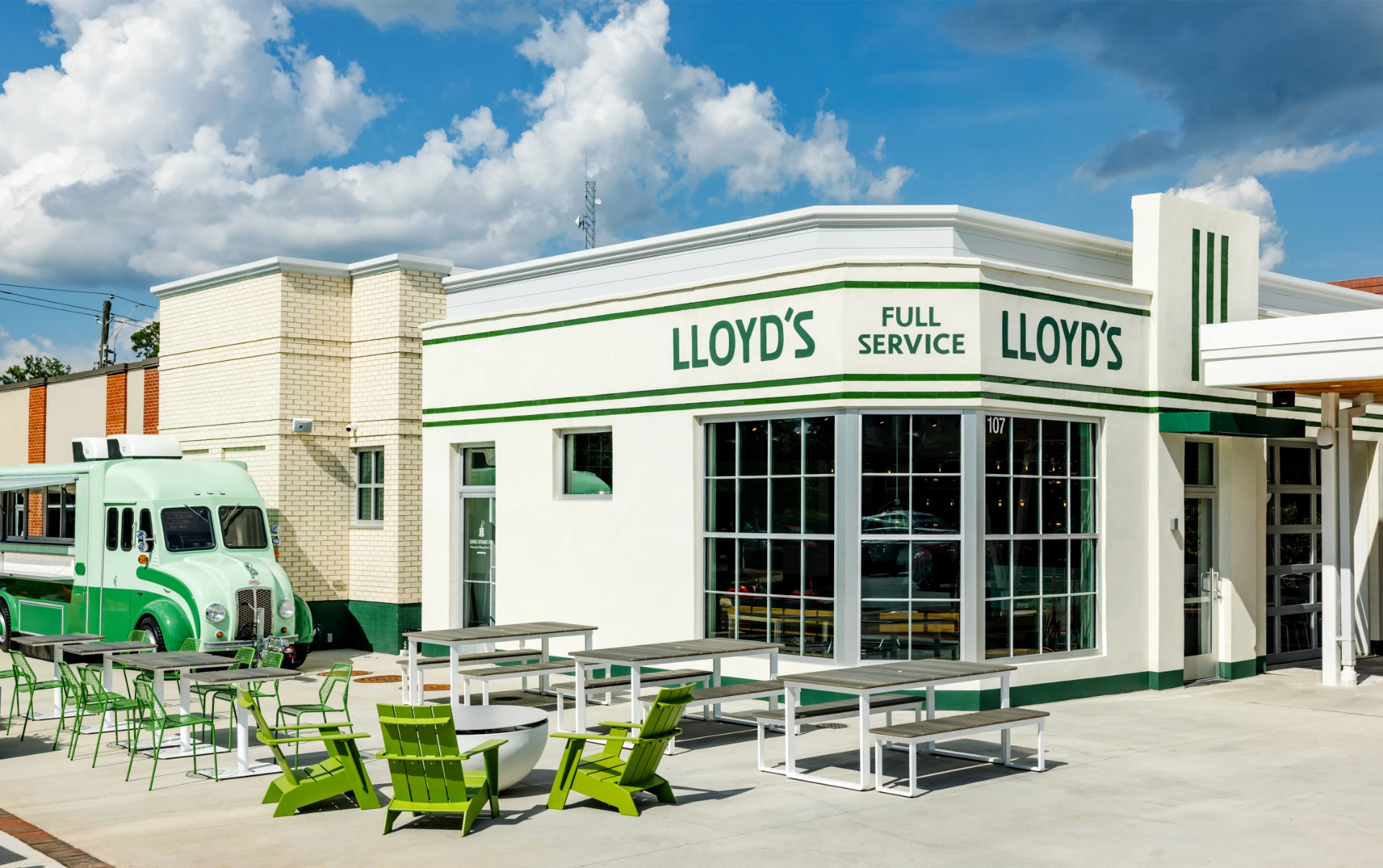
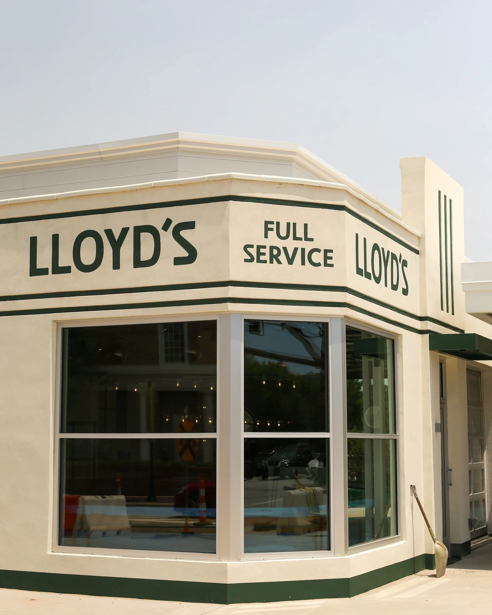
Before it was Lloyd’s, the building on the corner of Chatham and Academy in downtown Cary was a service station, built in the 1940s and known to the neighborhood simply as the cheerful looking place on the corner. Today it’s a restaurant.
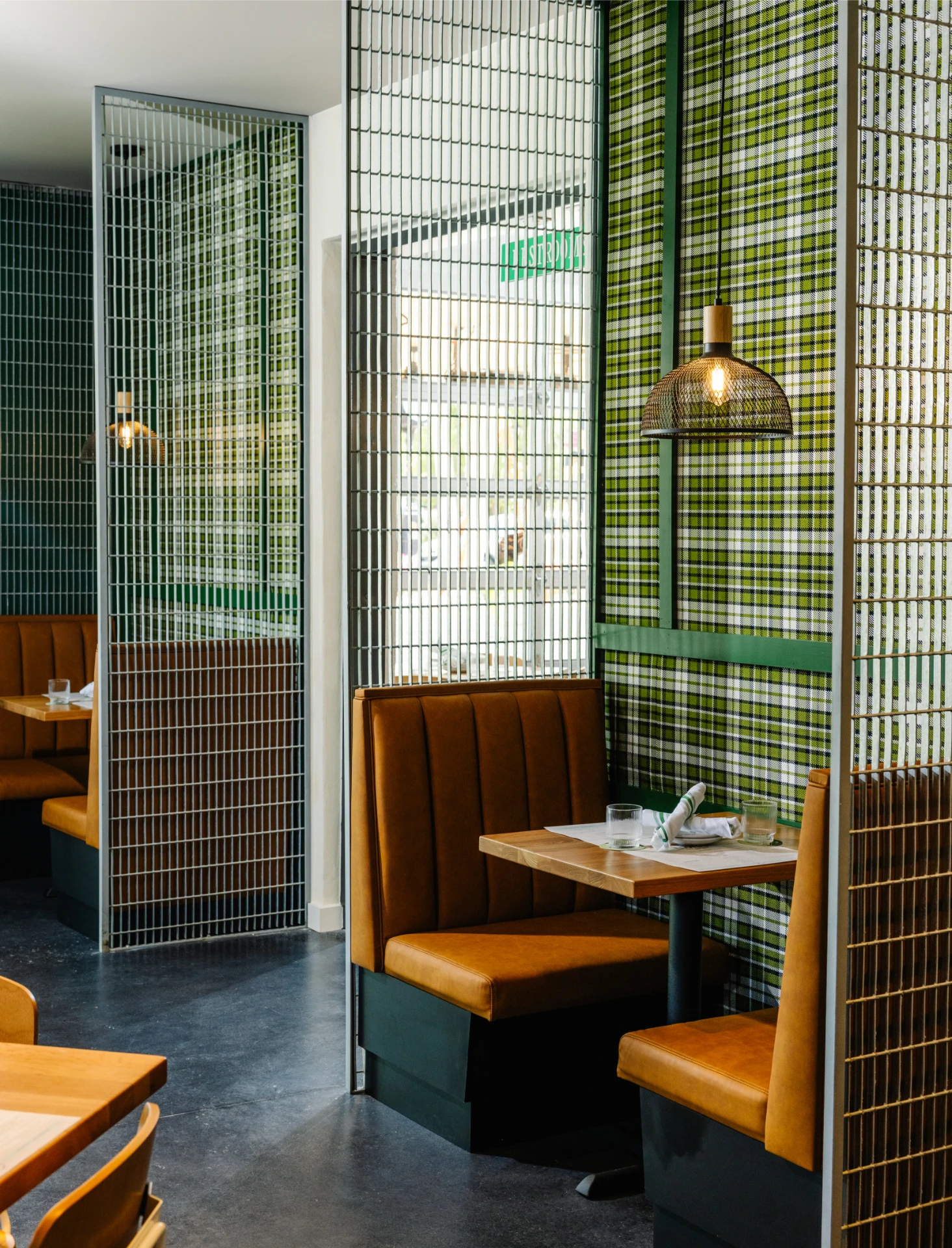
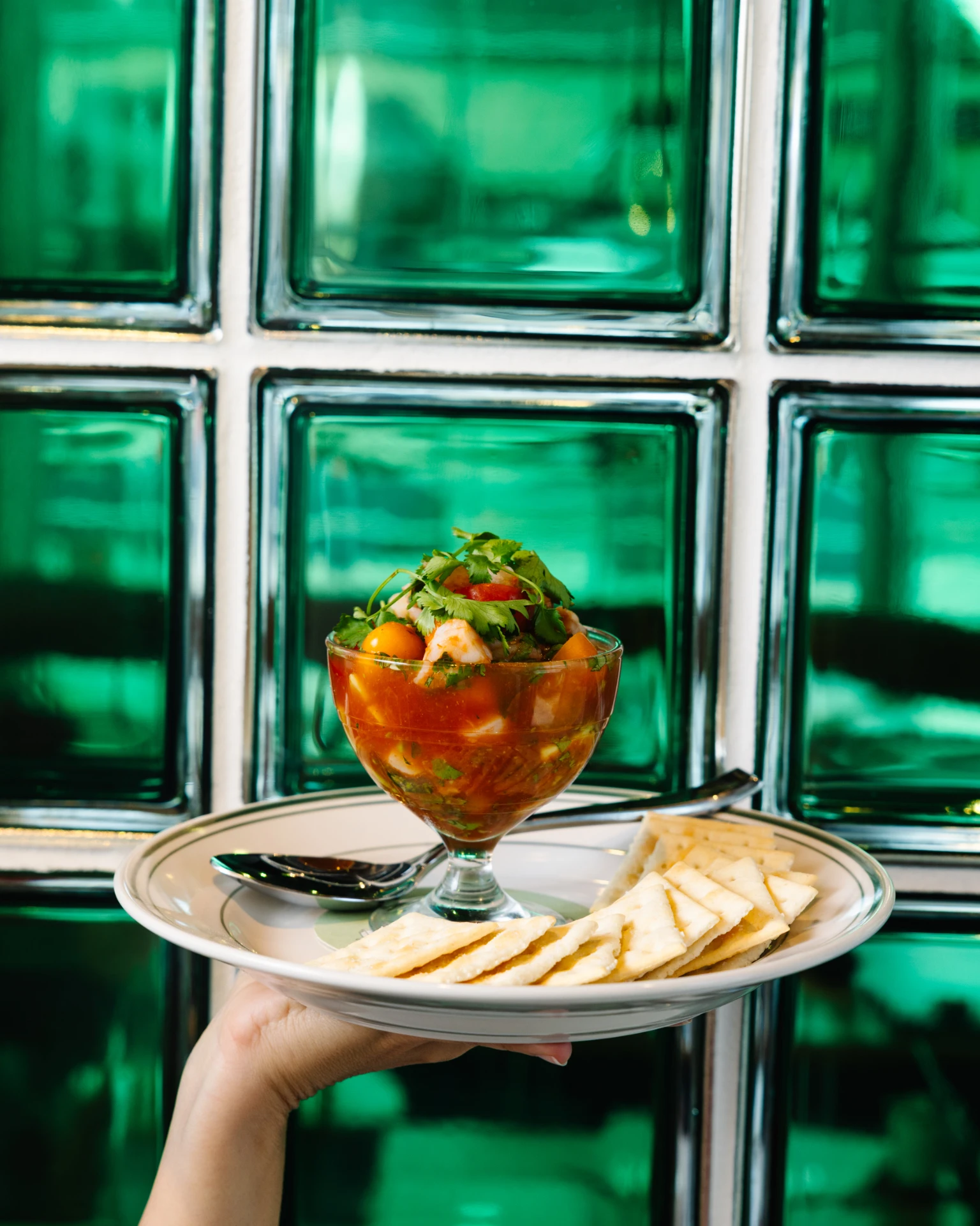
Early Bird Night Owl, the hospitality group behind The Durham and The Mayton boutique hotels, brought the building back to life as a new neighborhood dining and drinks concept, one that needed to feel like it had always belonged on Main Street rather than dropped into it. The brief called for casual polished rather than polished casual, a genuine, well-curated beverage program on equal footing with a wholesome, seafood-leaning menu, and enough personality to become a true cornerstone of a downtown still very much on the rise.
The Work
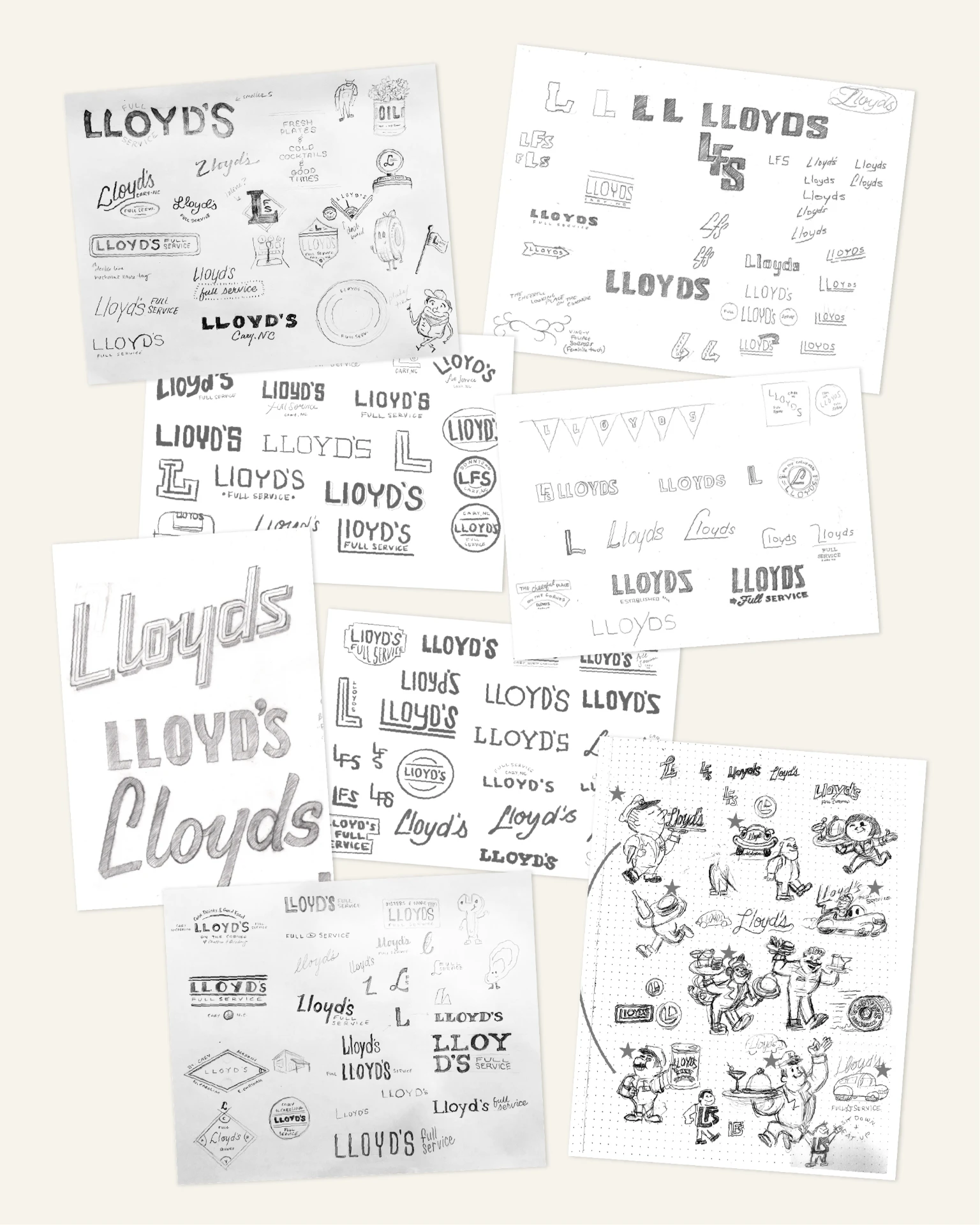
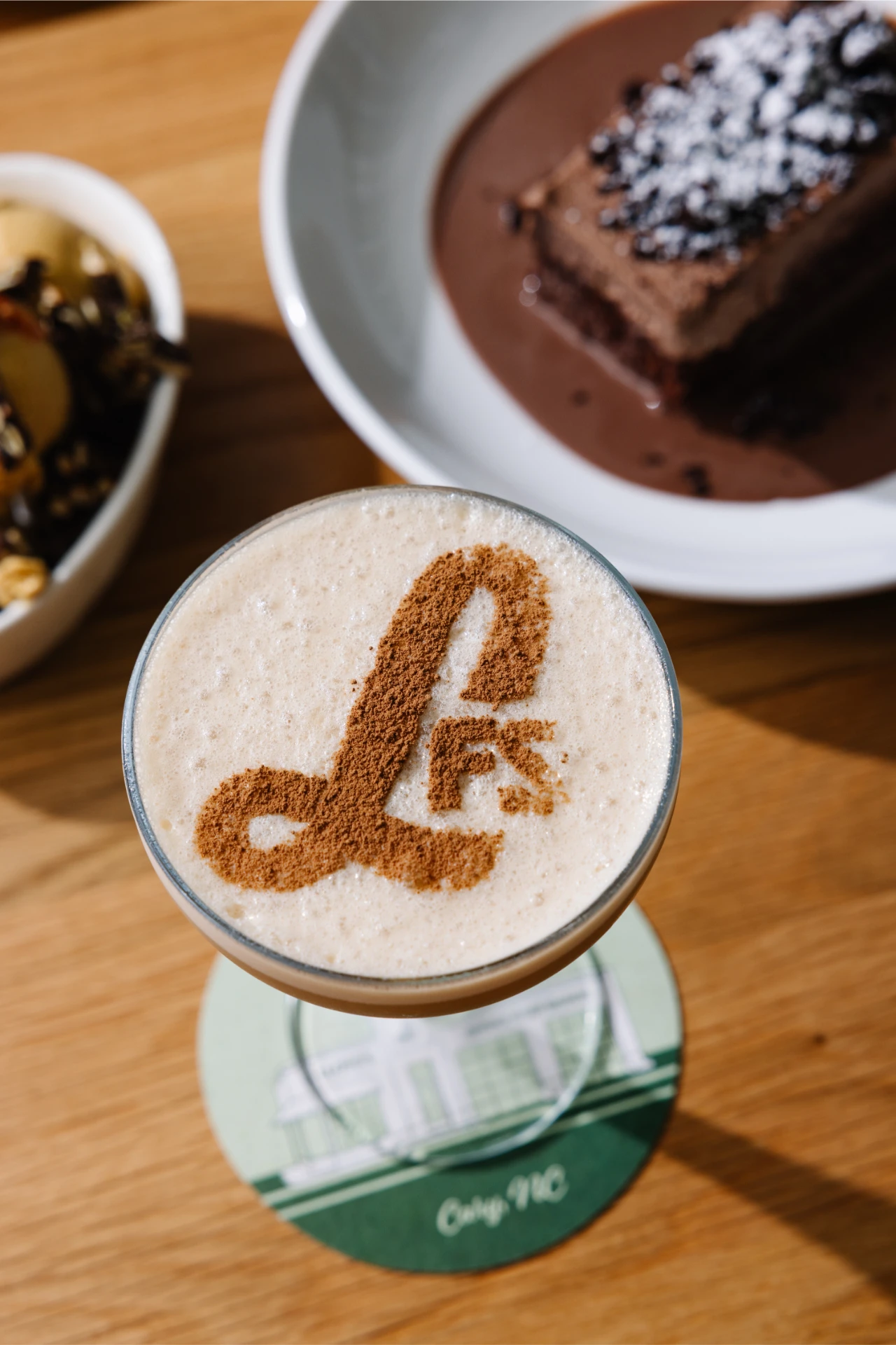
MRC started with a naming exercise and positioning work, exploring names rooted in the building’s own service station history. Archival photos and old signage turned up the building’s original identity as Lloyd’s Amoco Service, and that discovery shaped the direction the brand ultimately took, staying close to home rather than reaching for something invented. From there, we built a full identity system with 10 logo marks across primary, secondary, tertiary, and monogram treatments, giving Lloyd’s a mark for every use case from a menu cover to custom-painted signage.
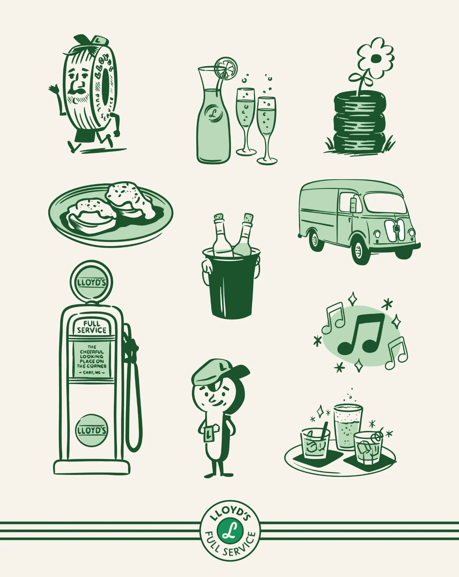
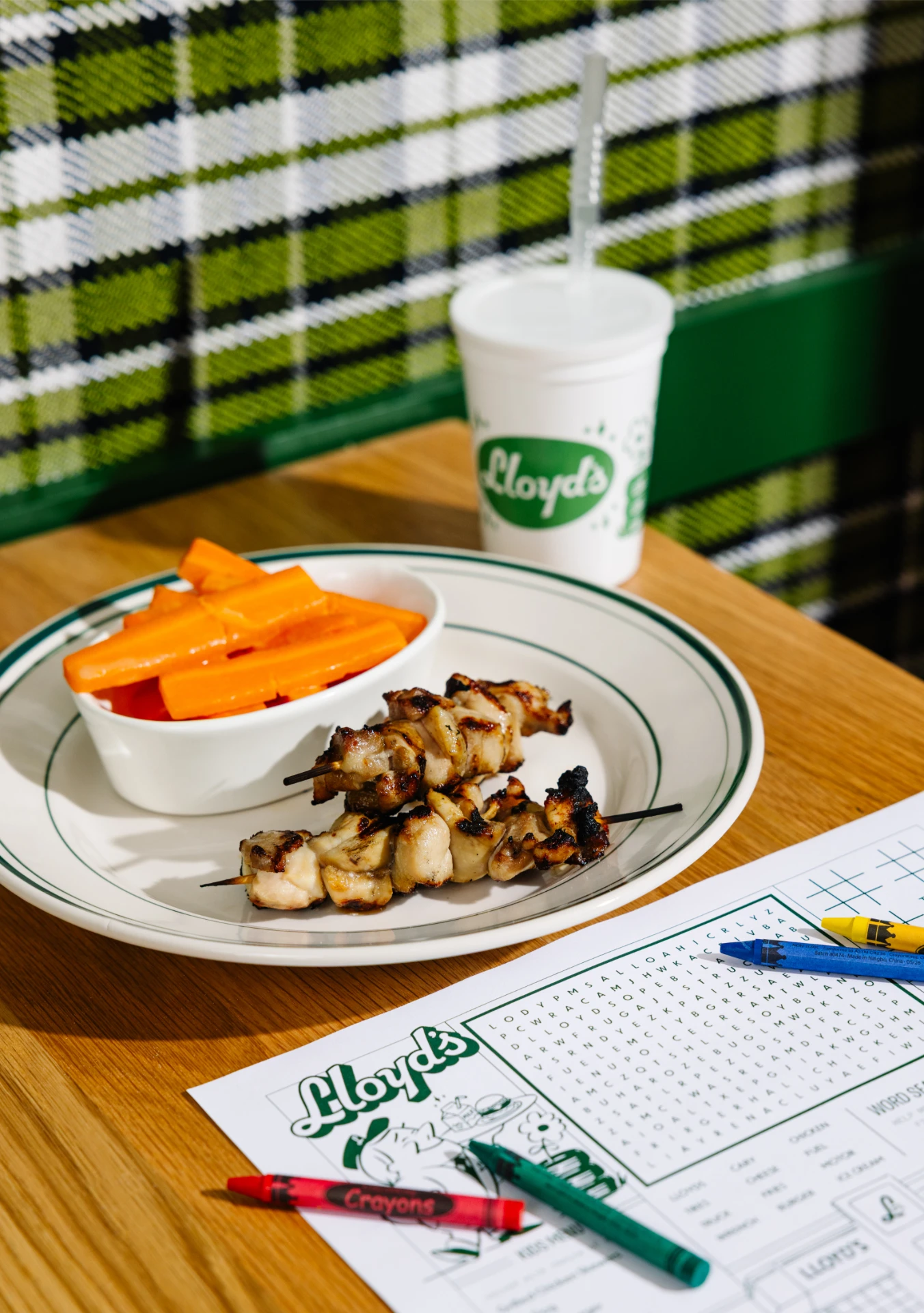
The system also includes Sparky, a brand mascot who personifies the mechanics of Lloyd’s past, coveralls, wrench, and all, now carrying a tray of food and drinks instead of tools. A full set of custom badges and illustrations rounds out the brand, hand-drawn icons of cocktails, salads, the original gas pump, and a delivery van, alongside day and night illustrations of the building itself. Brand messaging and copywriting, developed alongside Marc Lewis, gave the visual system a voice to match: direct, a little playful, and rooted in the building’s own history. Every piece carries the same balance of play and polish, vintage-inspired but not costume-y, understated but not plain.
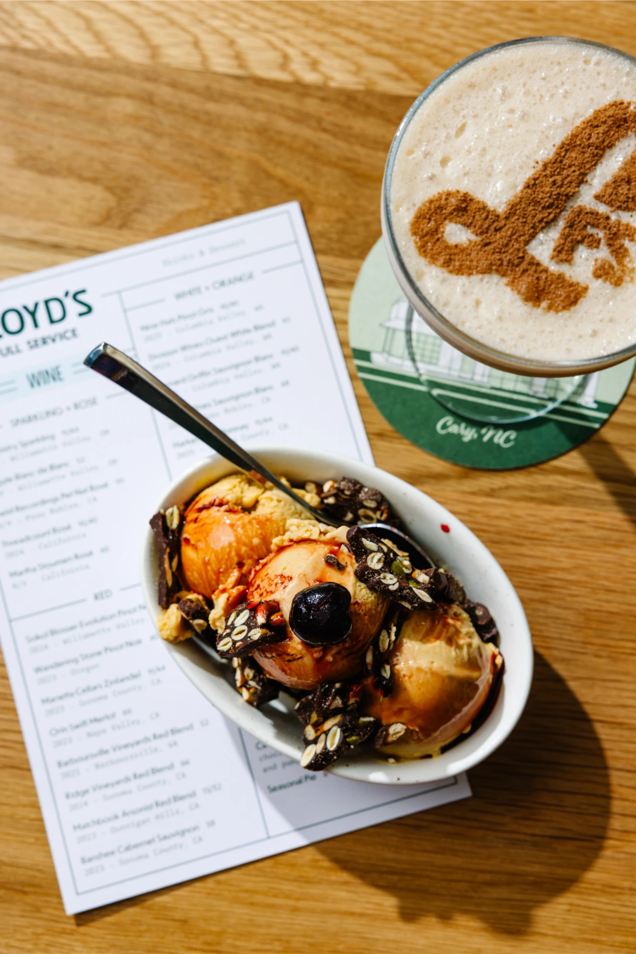
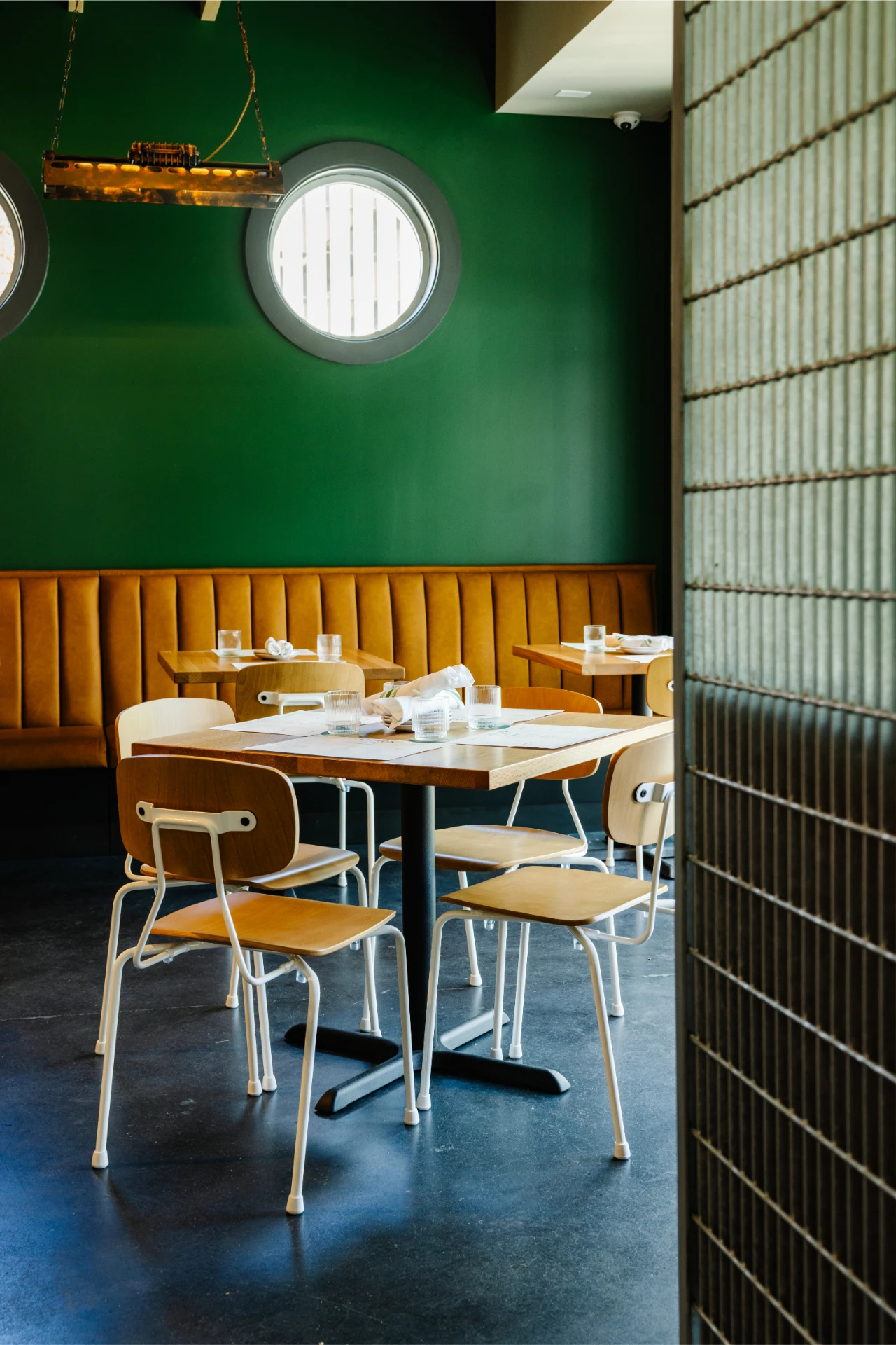
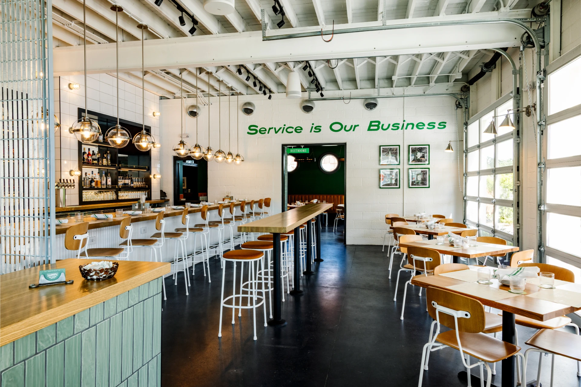
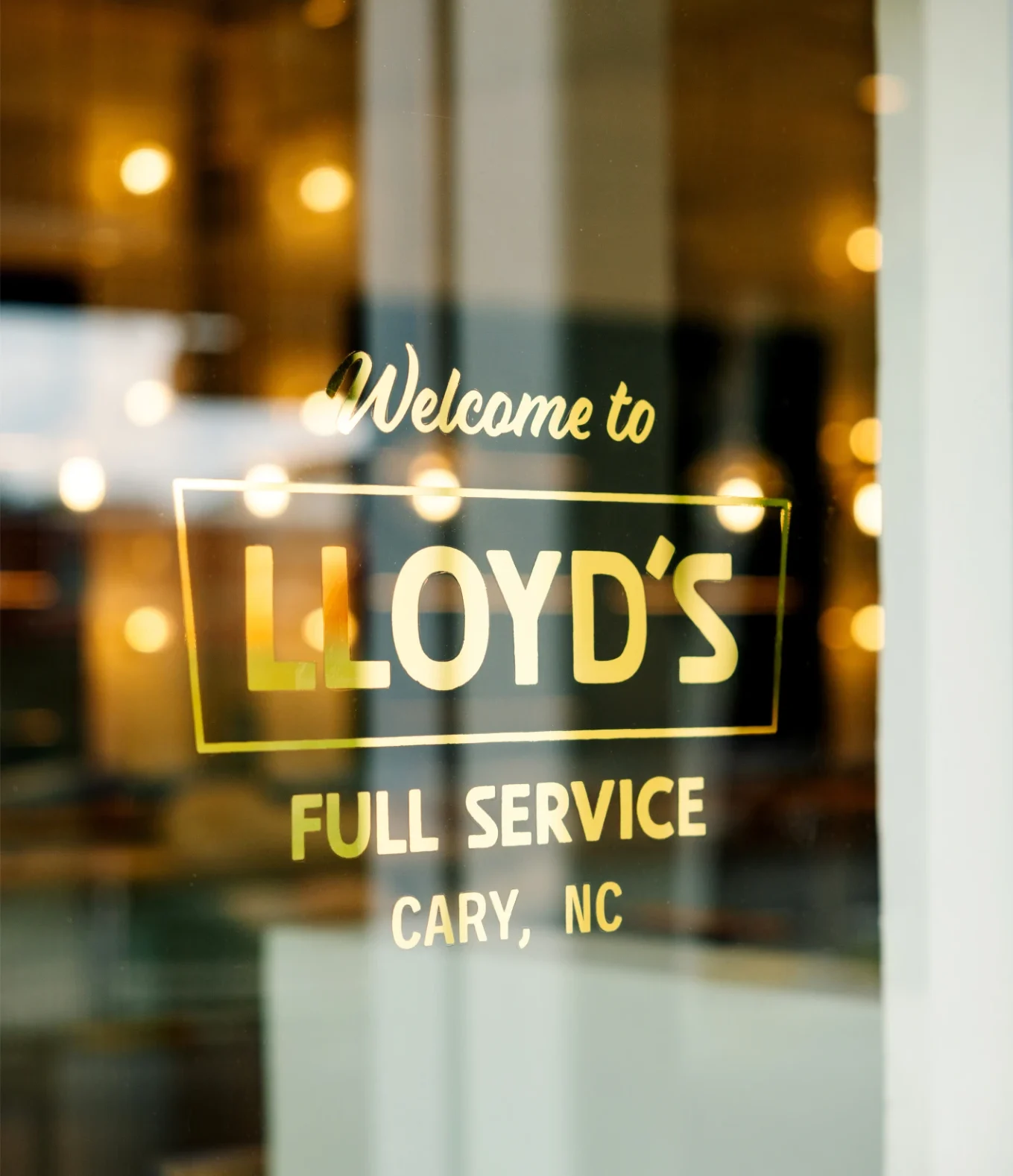
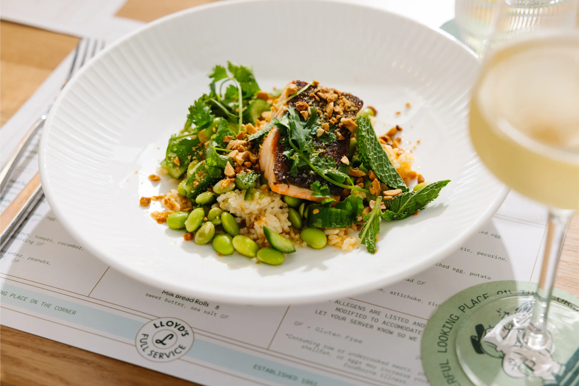
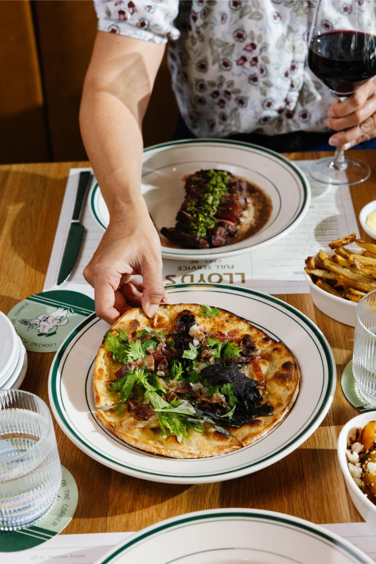
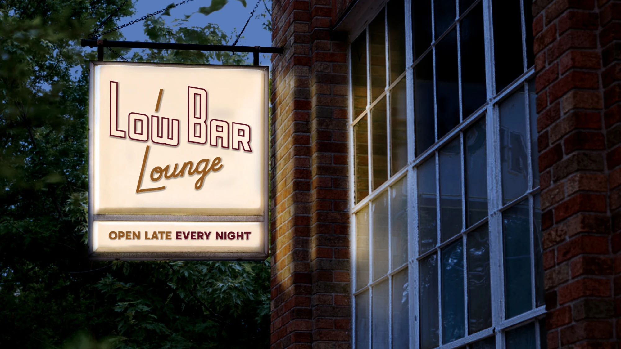
Branding a building this rooted in place meant thinking beyond the logo. We worked alongside the interior design and architecture team on placemaking throughout the physical space, including custom-painted, hand-finished indoor and outdoor signage, bathroom signage, and murals inside, along with a fully custom menu design and merchandise built to carry the brand off the walls and into people’s hands.
A Continued Partnership
Lloyd’s is MRC’s second branding project with Early Bird Night Owl. We previously partnered with the group on the Durham Hotel website, branding for the Willard rooftop bar and lounge, event graphics for their annual Oyster Fest, and more.