The Brief
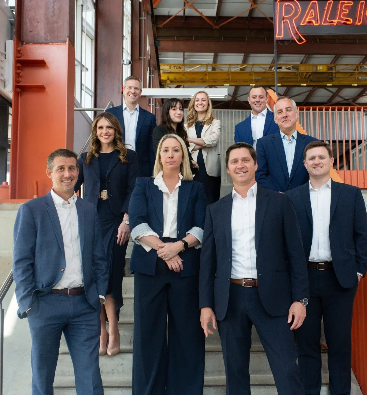
Manning Fulton has been practicing law in the Triangle since 1955. The firm was built on the shoulders of Howard Manning, Charlie Fulton, Bill Skinner, and John McMillan, all legends of the North Carolina bar, and Charlie Fulton is still considered the founding father of commercial real estate law in the state. Seventy years on, the firm has never merged and never reinvented itself, which in a market where firms consolidate constantly is its own kind of proof.
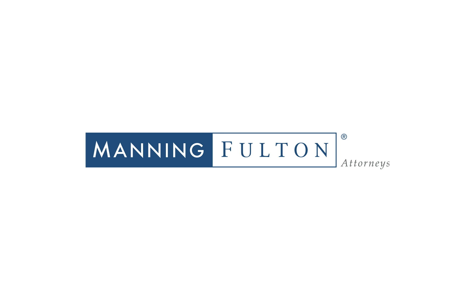
The brand had not kept pace. The existing logo dated to 2005 and had been through two tagline changes since. Its long horizontal format was hard to use on promotional material and hard to read in ads. More to the point, it read as an established Raleigh firm leaning on its history, when the firm competing today is nimble, has the third largest M&A practice in the Triangle, and is actively recruiting young talent against much larger firms.
The ask was evolution, not reinvention. Modern enough to signal a forward-looking firm, established enough to hold seventy years of equity. Nothing flashy, nothing playing it too safe, and none of the scales-of-justice cliches the legal category runs on.
The Work
MRC led brand strategy, positioning, and identity.
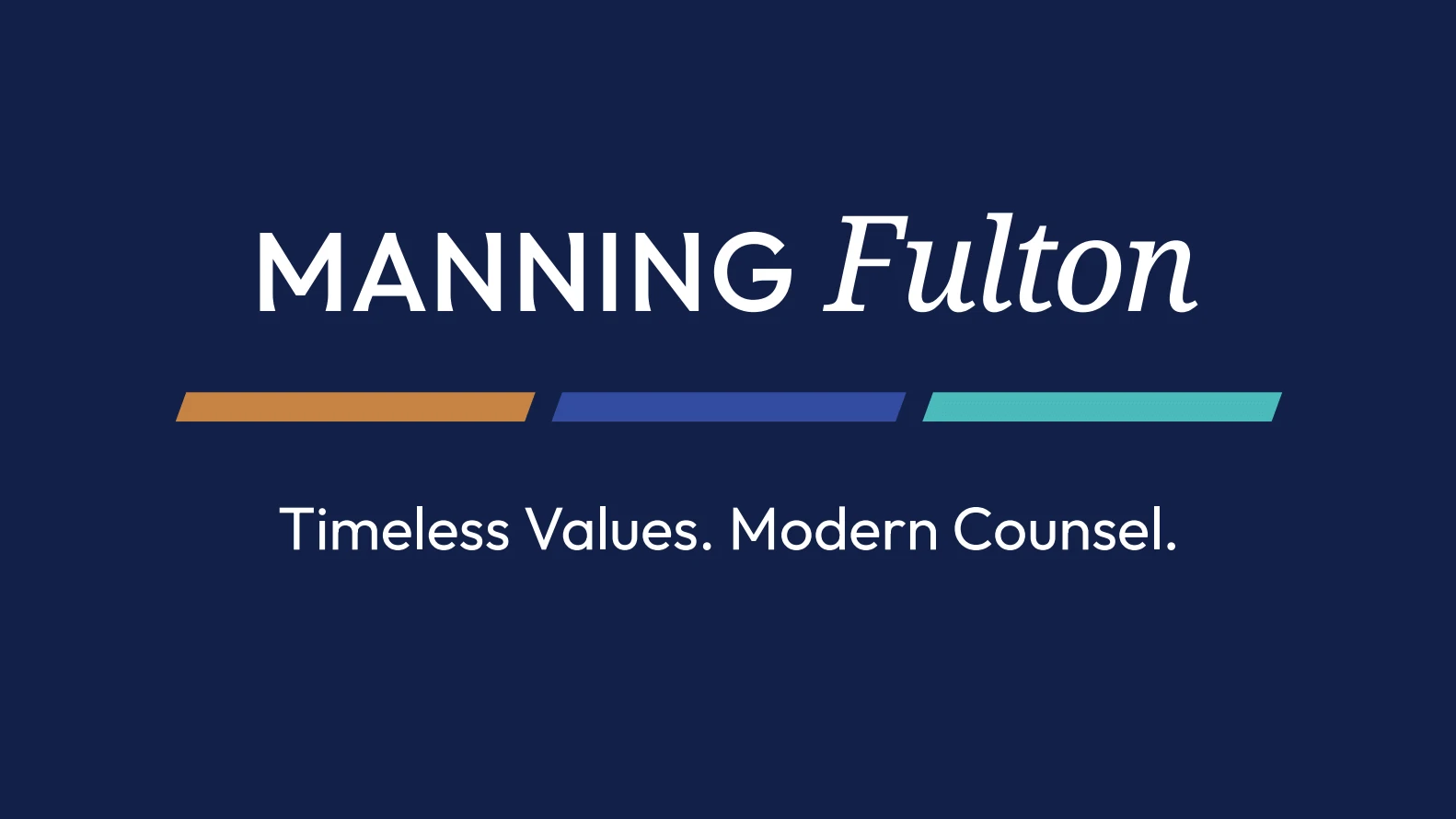
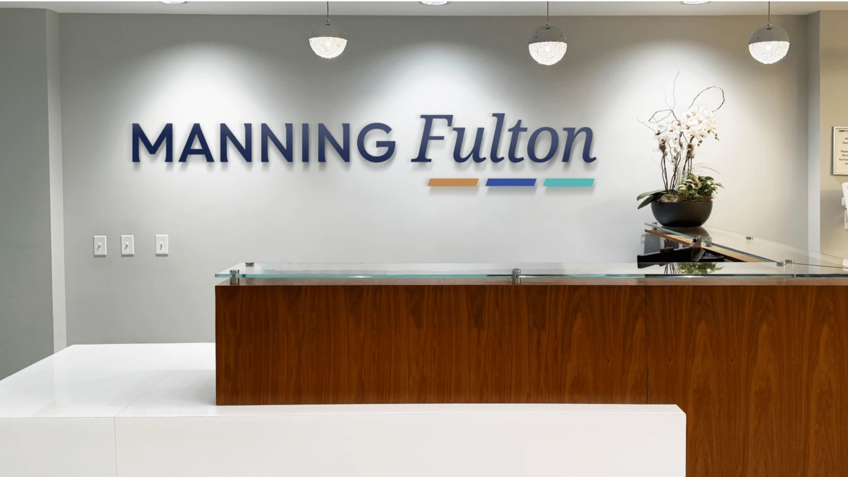
The logotype does the heavy lifting. Manning is set in all caps, strong and direct, a nod to Howard Manning’s unconventional and aggressive approach. Fulton is set in italic, more traditional, reflecting Charlie Fulton’s methodical style. That split honors the logic of the original 2005 mark, where two typefaces represented two founders, while giving the firm something that reads cleanly at any size.
Three angled bars sit beneath the name, one for each of the three leaders who shaped the firm’s standing in North Carolina law. Their forward slant is the point, a firm with deep roots and a forward-looking mentality.
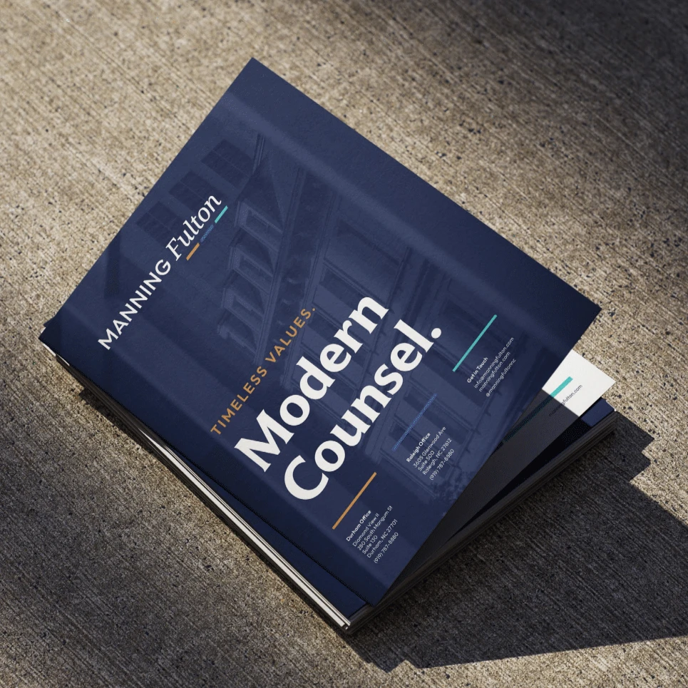
The palette keeps Manning Fulton’s blue and moves it to navy, then introduces accent colors that give the brand room to move across practice areas without losing itself. Two taglines came out of the positioning work, with Timeless Values. Modern Counsel. leading the identity.
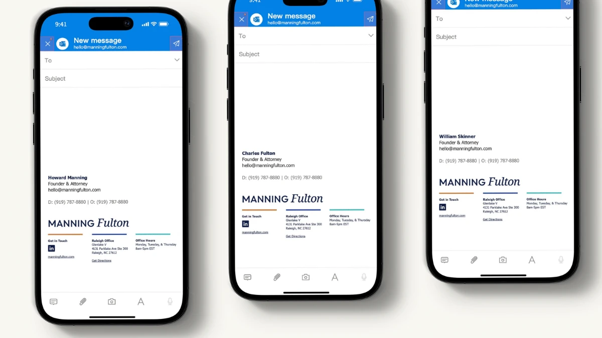
The result is a mark that works as a full lockup or a simplified MF monogram, in print, on signage, in a proposal, and on a business card, which the previous long-format logo could not do.
MRC felt like an extension of our team from day one, with communication that was always open, honest, and transparent, even through the harder decisions. They took the time to understand our firm's history, culture, and goals, and translated that into a brand that reflects who we are.