The Brief
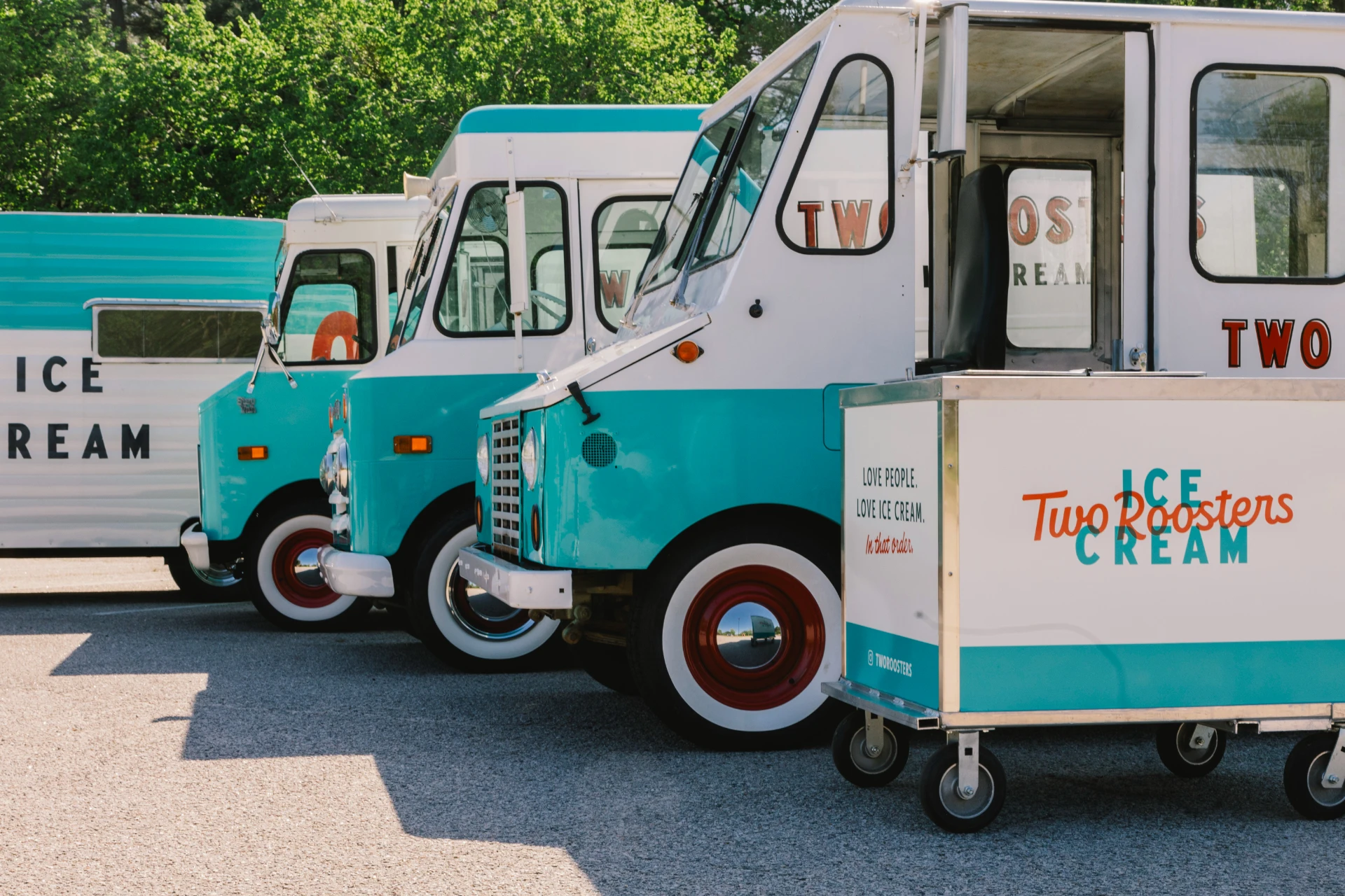
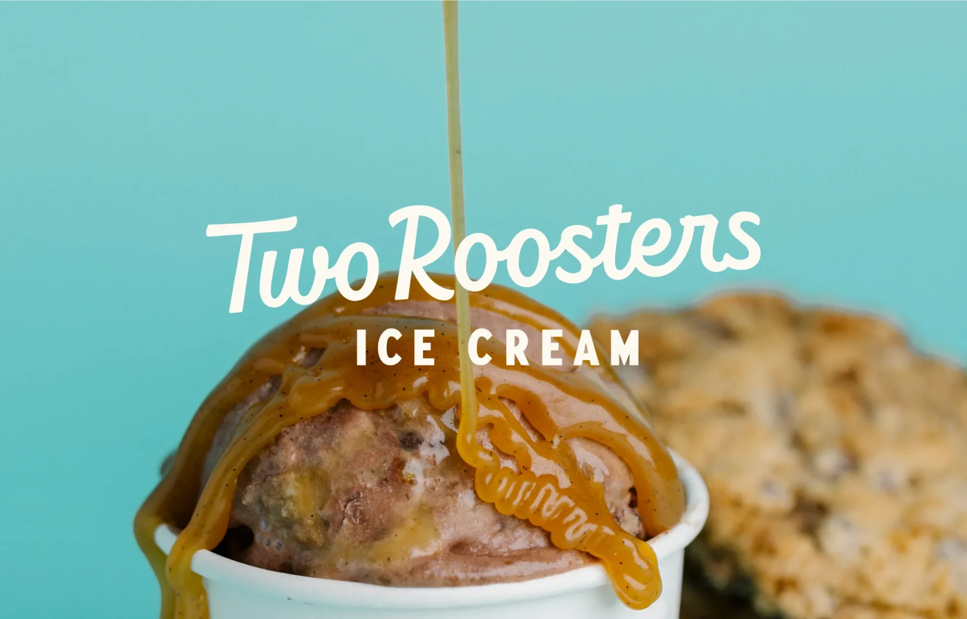
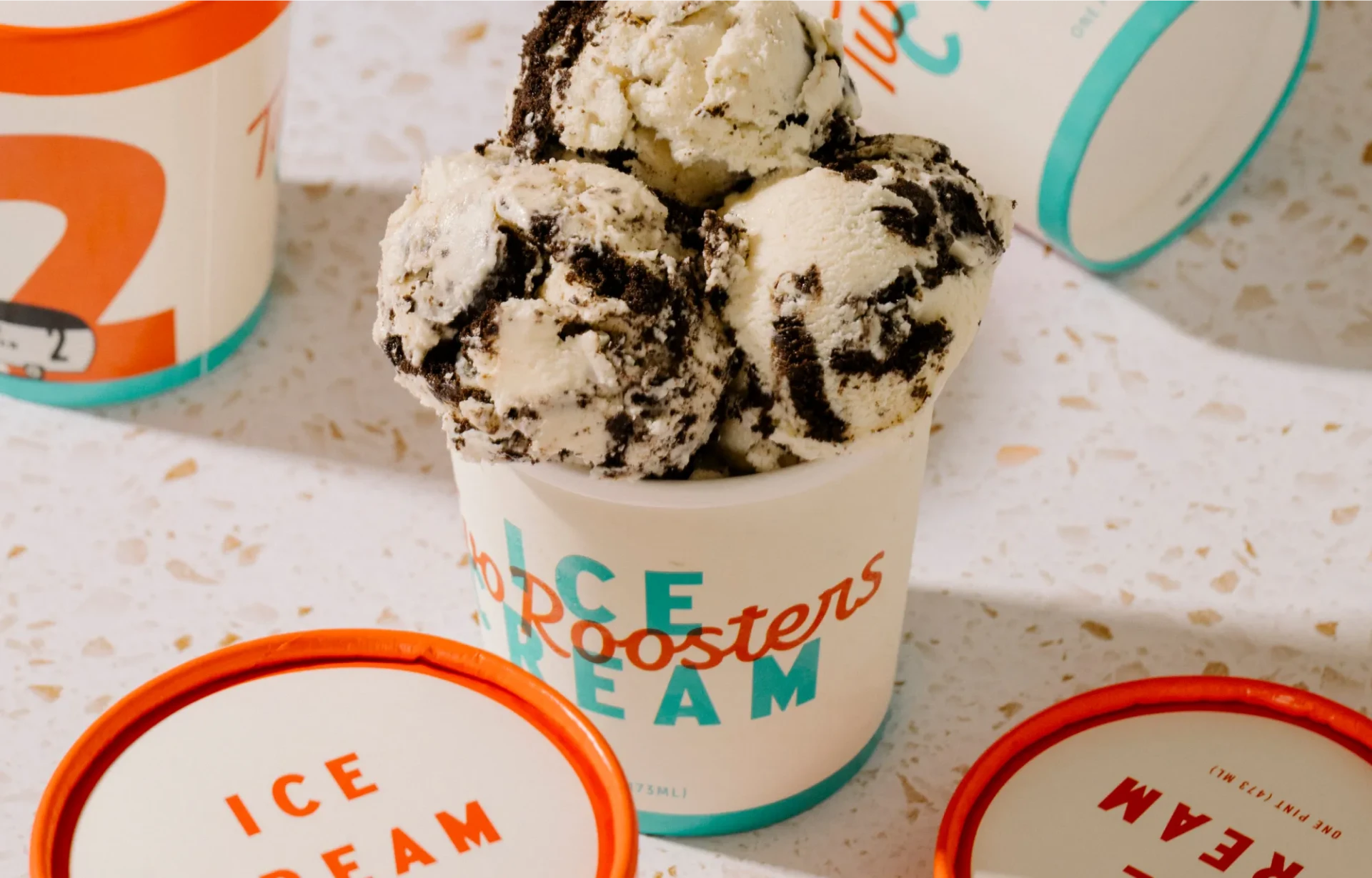
Beloved by locals and a staple across Raleigh, Durham, and beyond, Two Roosters started in 2015, selling ice cream out of a custom vintage trailer. They quickly became a Triangle favorite known for handcrafted, premium ice cream, creative monthly flavors, and an instantly recognizable brand.
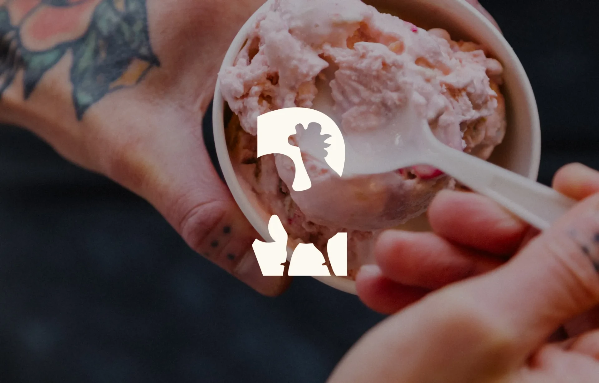
Throughout discovery it became clear that Two Roosters did not need a full rebrand. As long-time fans ourselves, it was important to preserve what made the brand unmistakably Two Roosters: the teal, the bold ICE CREAM type, the illustrated roosters. Our mission was to evolve the brand identity in a way that honored the existing equity while giving it room to grow.
The Work
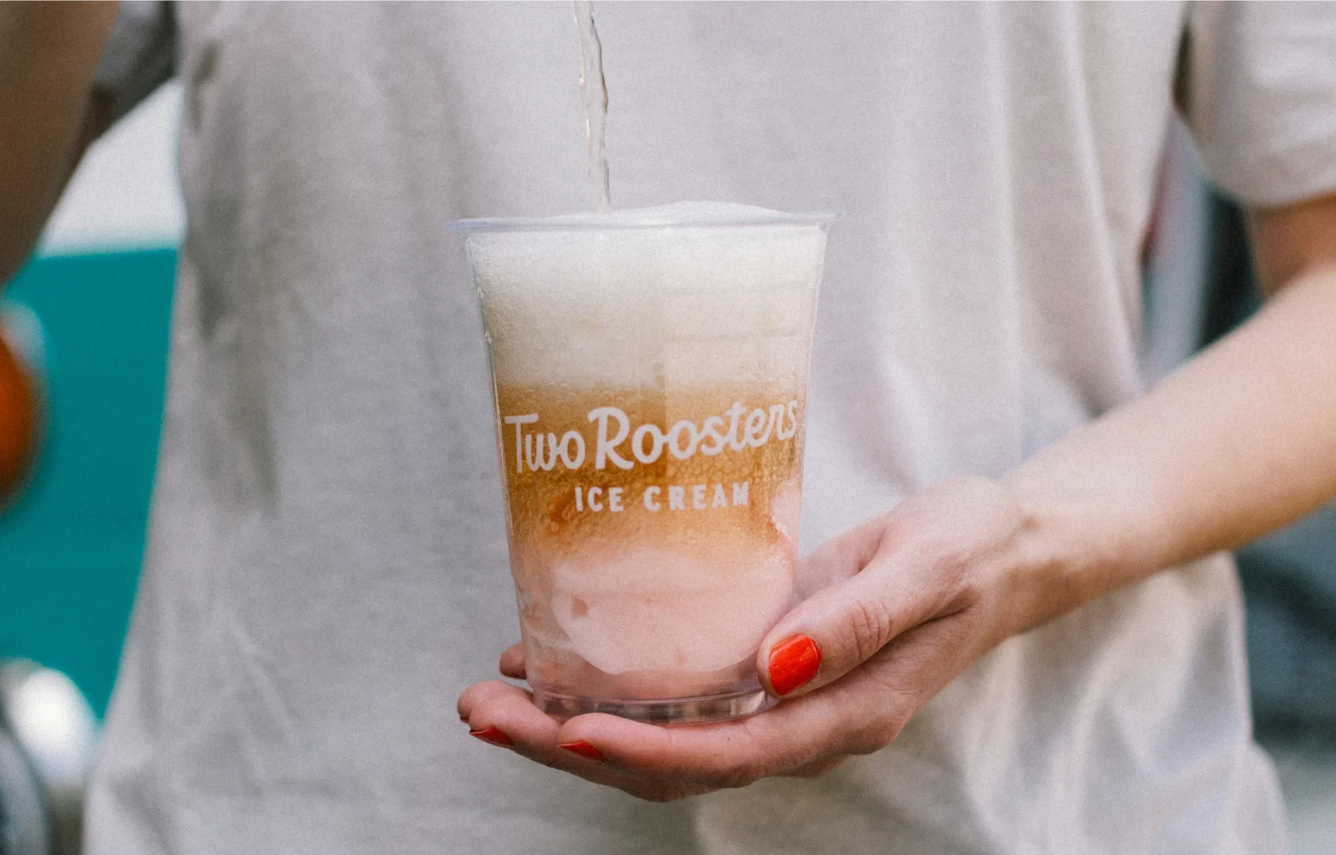
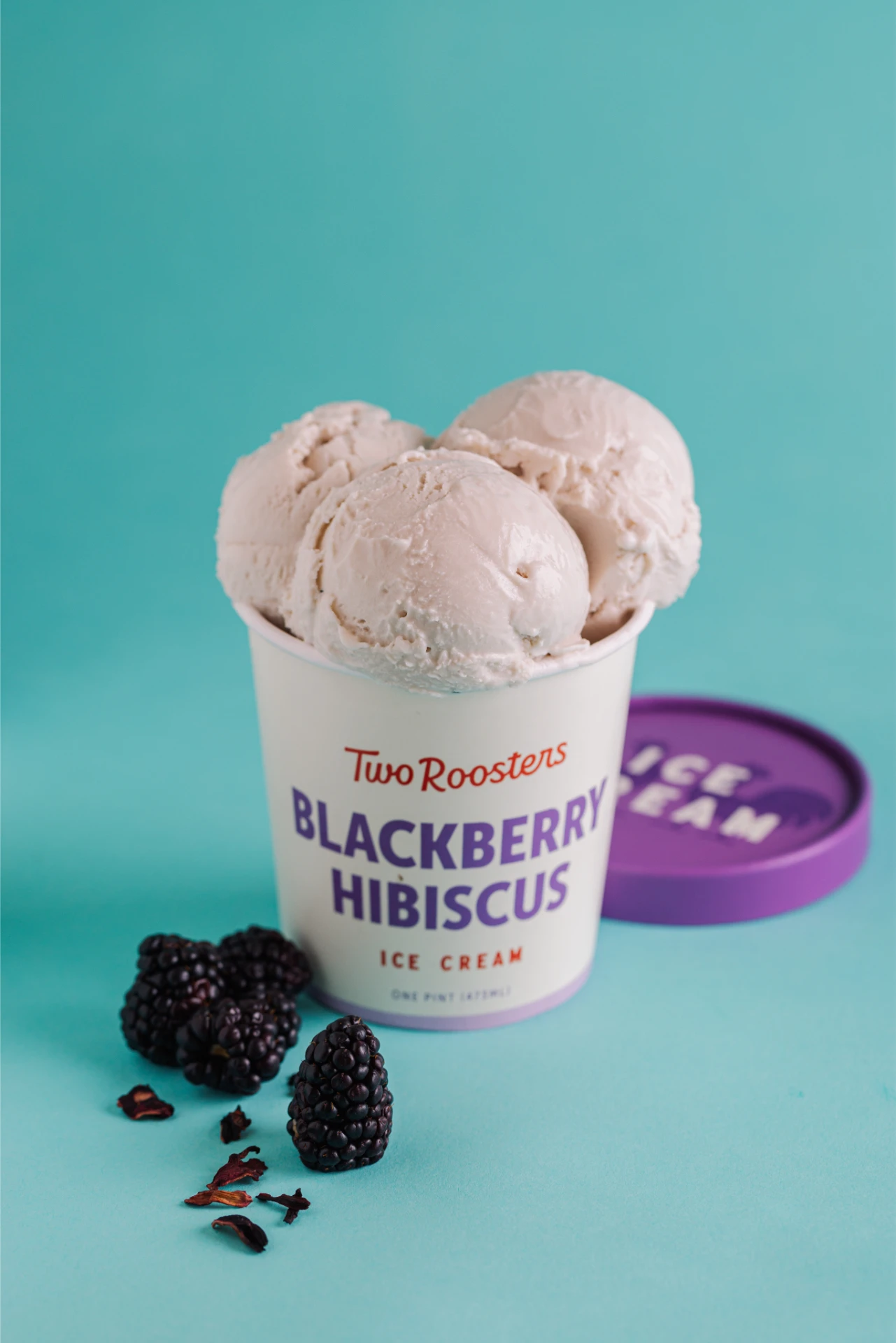
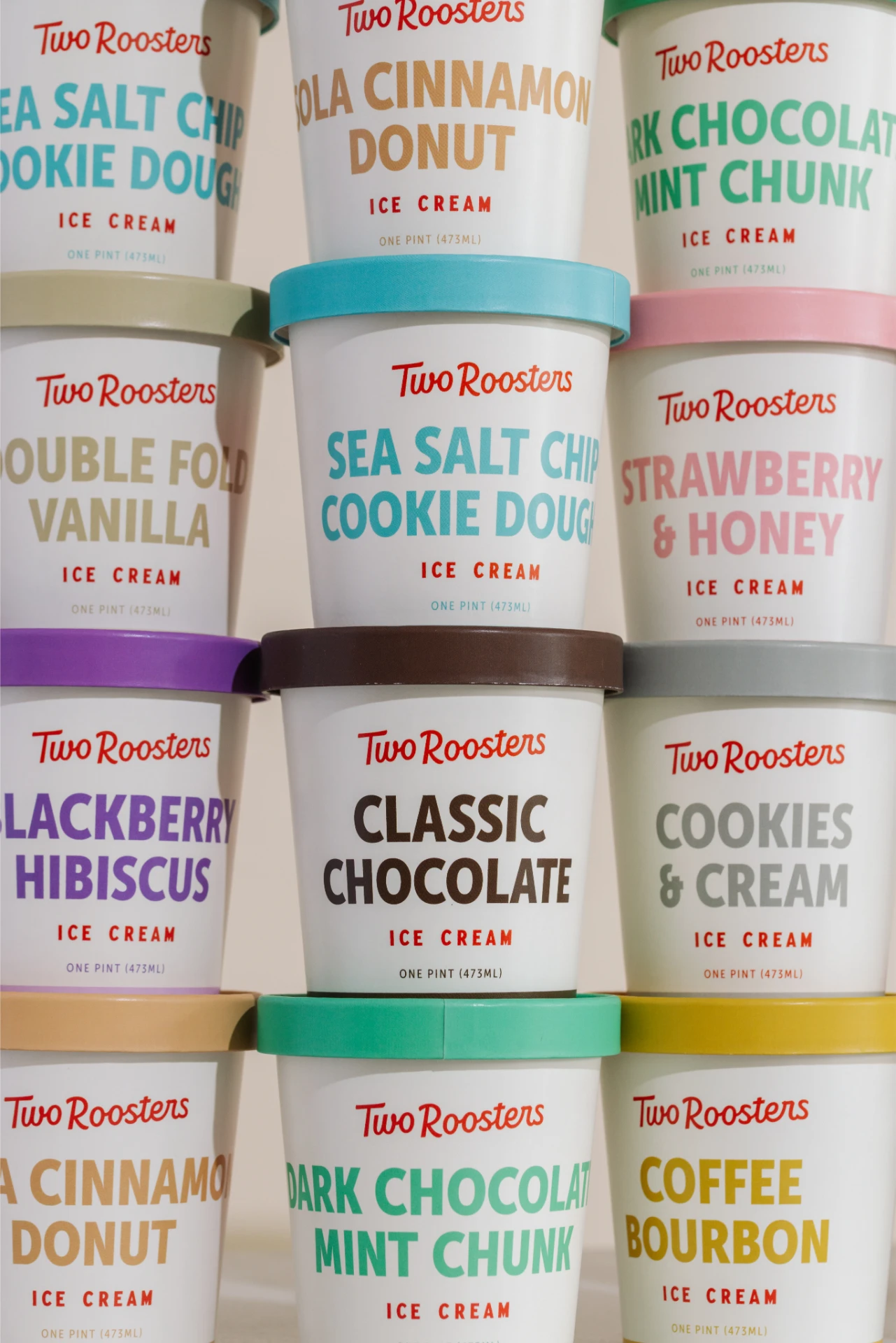
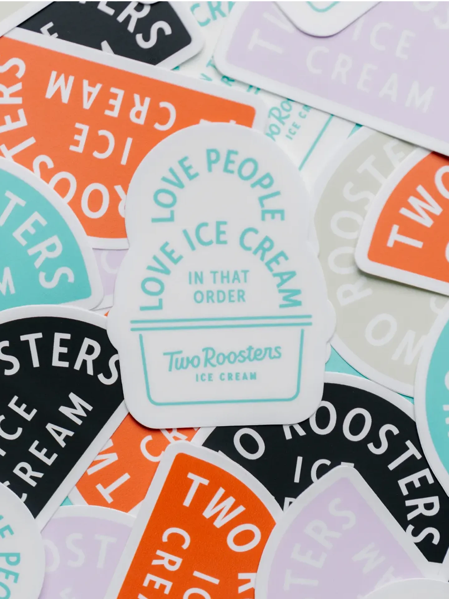
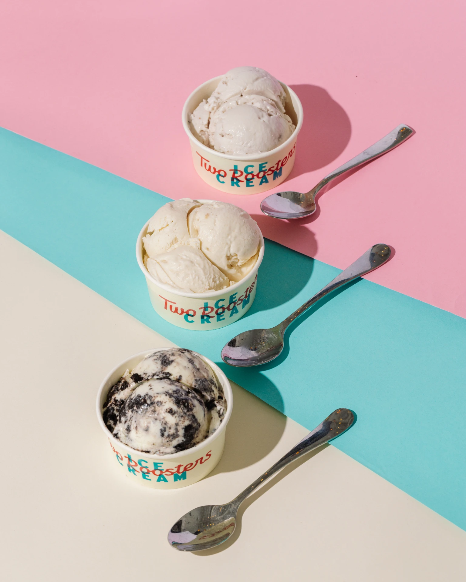
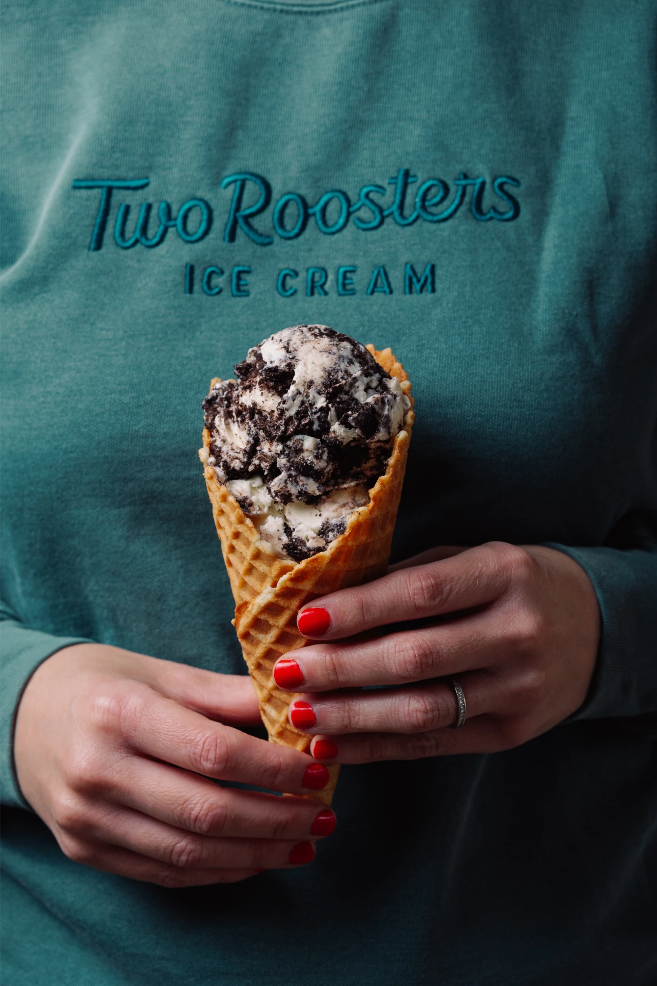
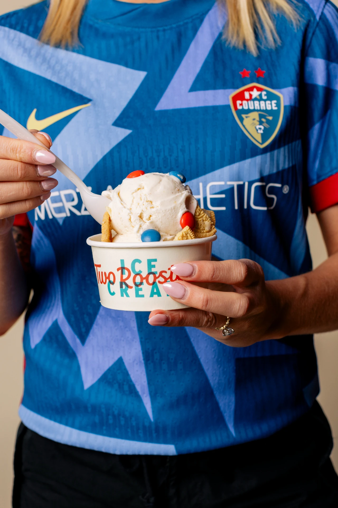
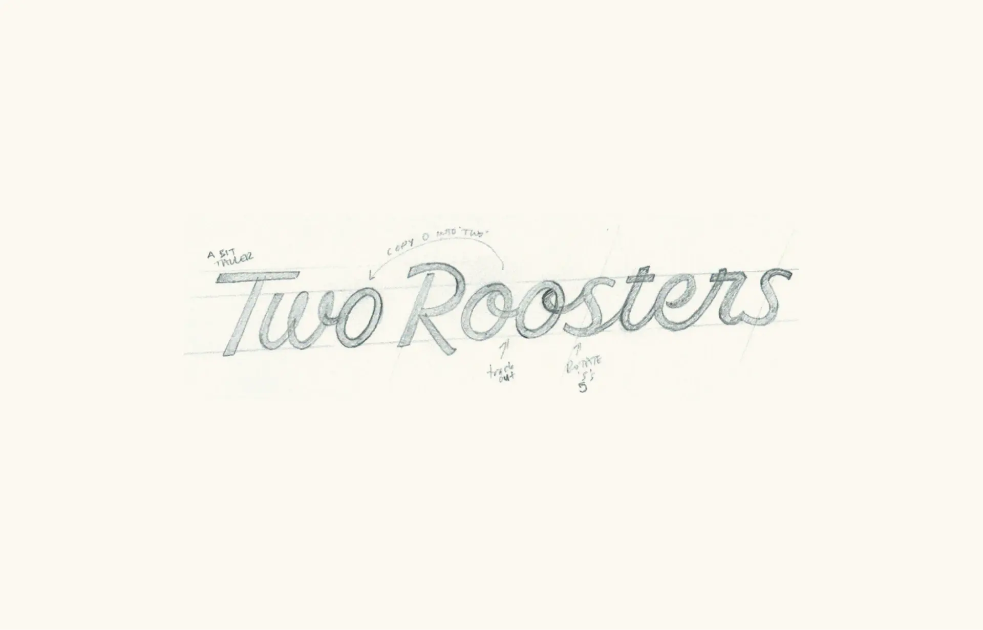
To honor the vintage aesthetic, we introduced a heritage-inspired, hand-lettered script logo that reflects the brand’s classic spirit. We refined the illustrated roosters, added two charming mascots that embody the brand’s personality, and built a comprehensive suite of brand elements: new type pairings, an expanded color palette, and a full logo suite engineered for every application from a pint to a storefront.
The Ongoing Partnership
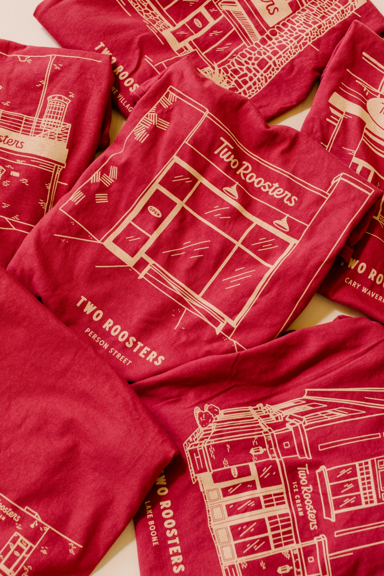
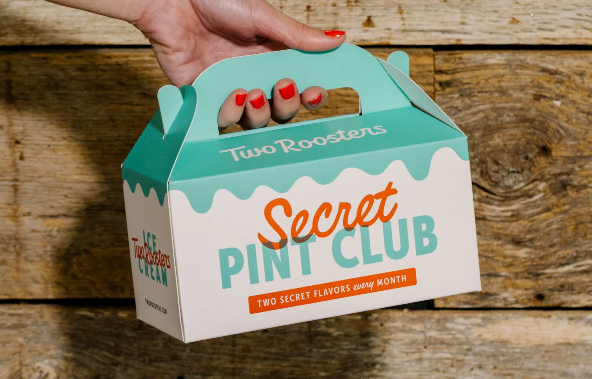
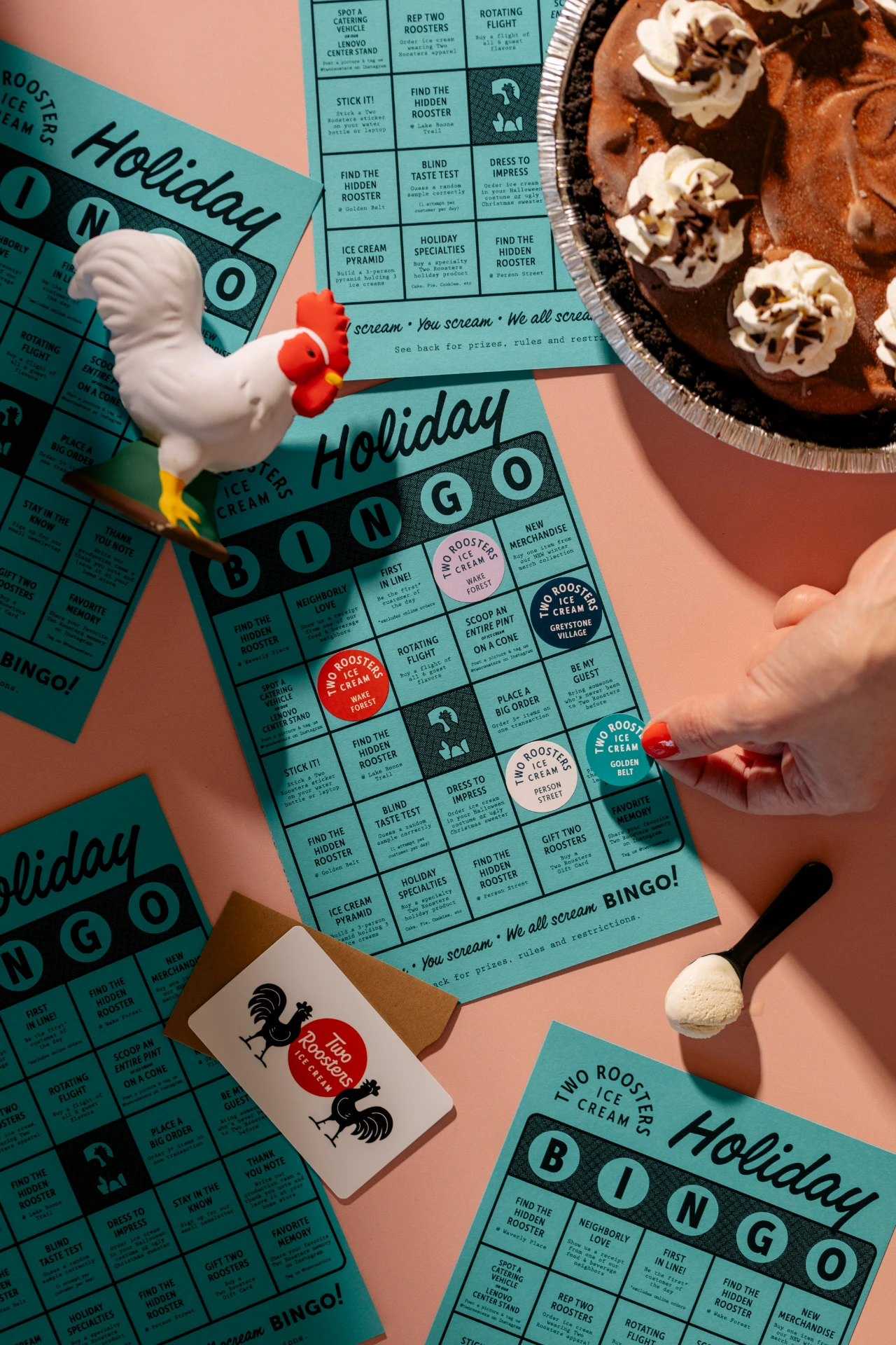
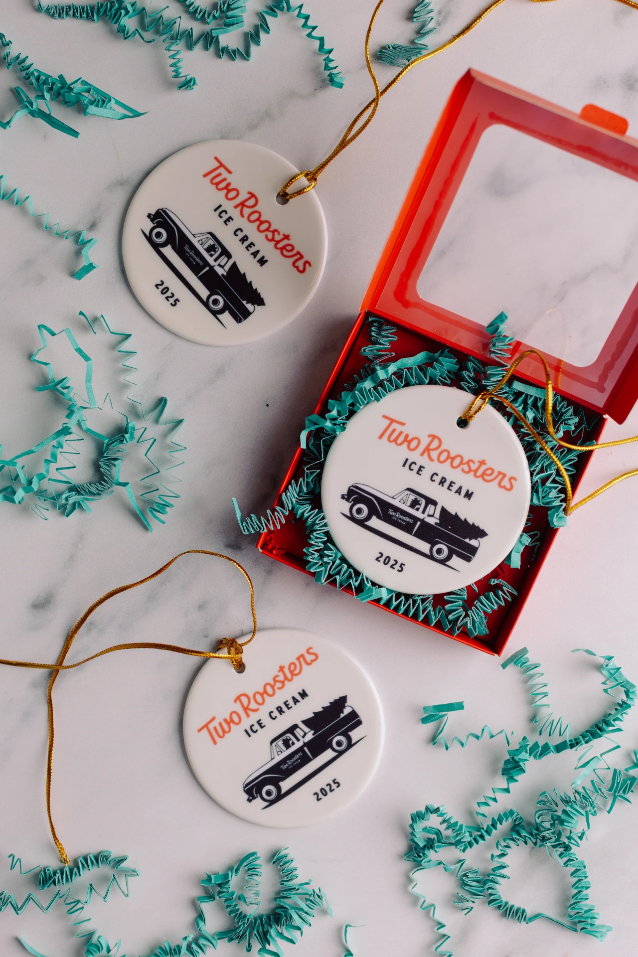
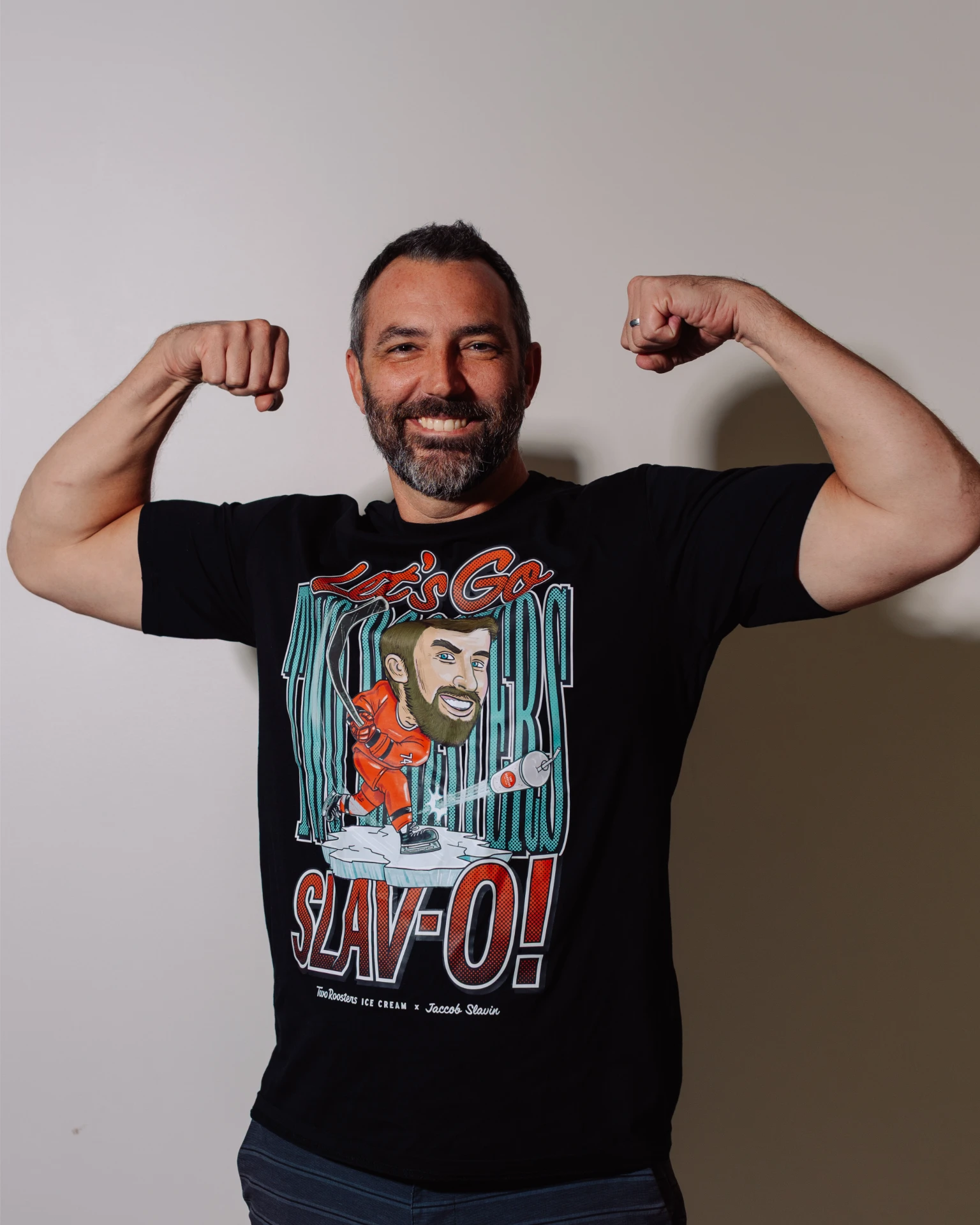
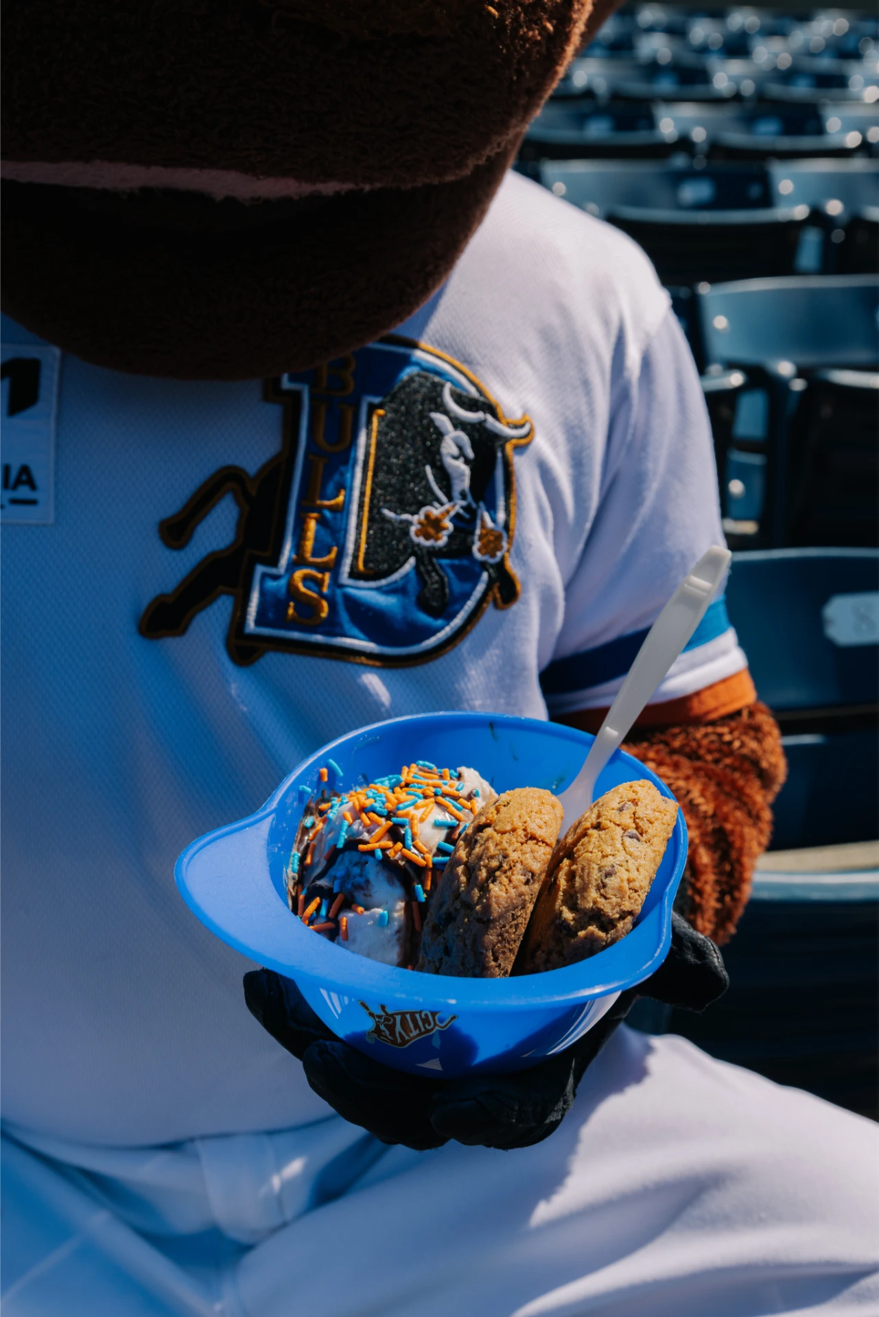
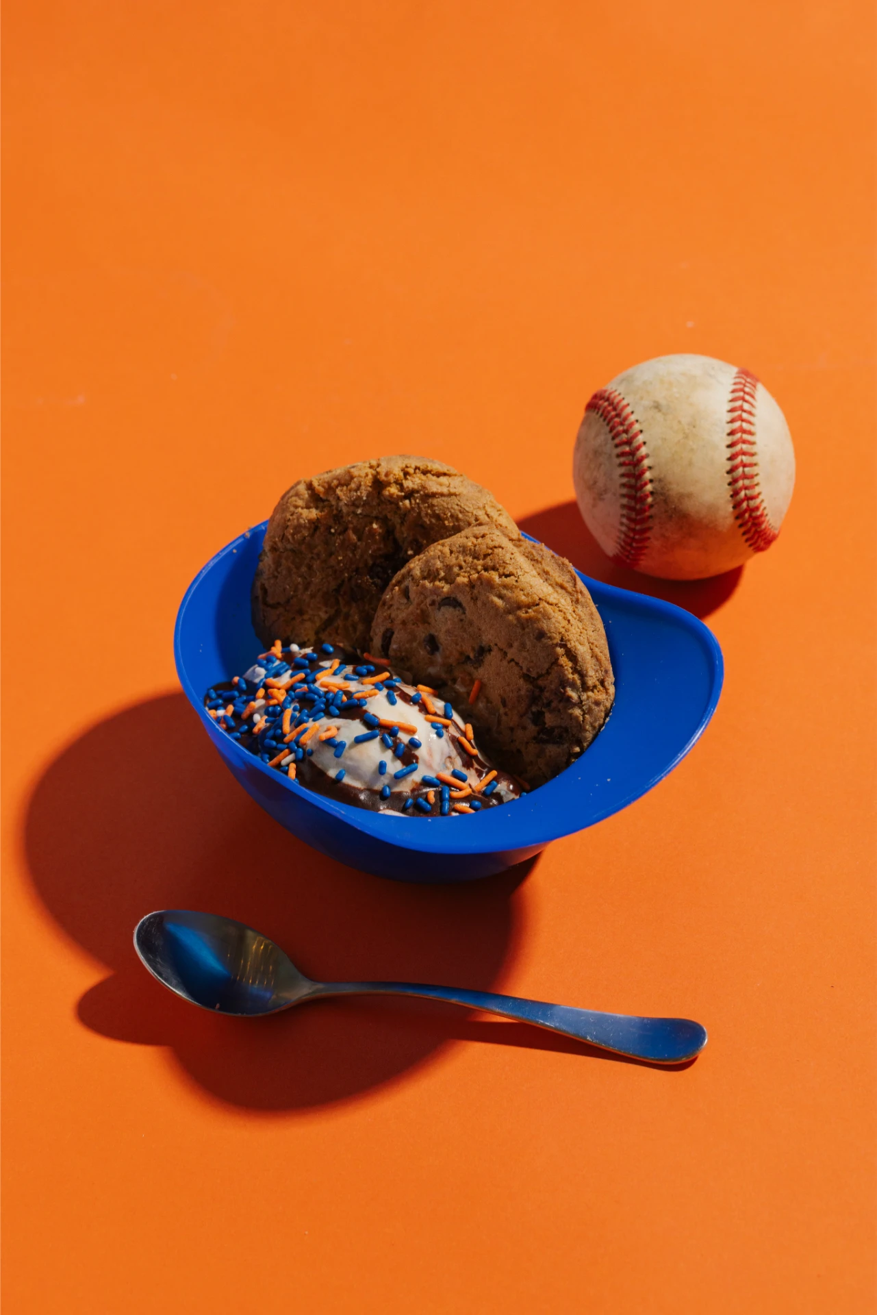
With the refreshed brand identity in place, the partnership did not end at handoff. Two Roosters remains an active MRC client, and the work has grown with them. We continue to support seasonal campaigns, merchandise design, freezer wraps, and environmental builds, including a branded stall at Lenovo Center. Whether it is a new merch drop, a packaging update, or a venue buildout, the Two Roosters brand shows up consistently because the system was built to travel.
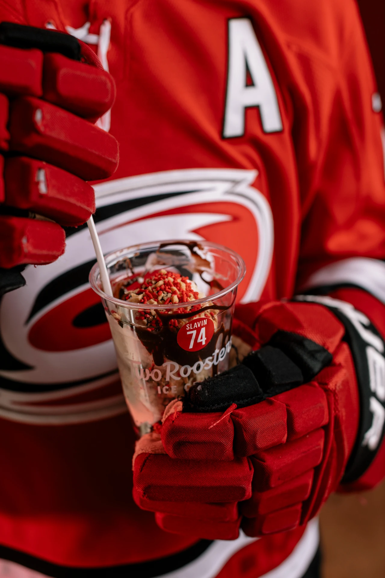
MRC has done a fantastic job collaborating with our team over the years! In addition to a full rebranding, they've helped us with t-shirt designs, graphics for our stores, social media content, and marketing materials for our promotions with NCSU Athletics, the Carolina Hurricanes, the Durham Bulls and more. We trust them completely, and they consistently deliver outstanding results!