Most restaurant brands are built for opening day. The best ones are built for location ten. There is a difference, and you can see it in every touchpoint from the logo to the menu to the signage system.
When that system is built right, it scales with you. When it is not, every new location, every new operator, every new vendor becomes a brand liability.
The restaurant industry spans every growth model, from traditional franchising to licensee agreements to multi-concept hospitality groups and hotel partnerships. Every one of these models has something in common. The brands that hold up are the ones built as systems, not improvised along the way.
The Problem With Most Restaurant Brands
Cook’s Burger Bar came to us for a restaurant rebrand knowing their brand was not doing the work it needed to. Their existing logo had the right spirit, but it was too horizontal for digital, too complicated for signage, and did not reflect the simplicity of what they were actually serving. Internally, they knew exactly who Cook’s was. The brand just could not say it yet.
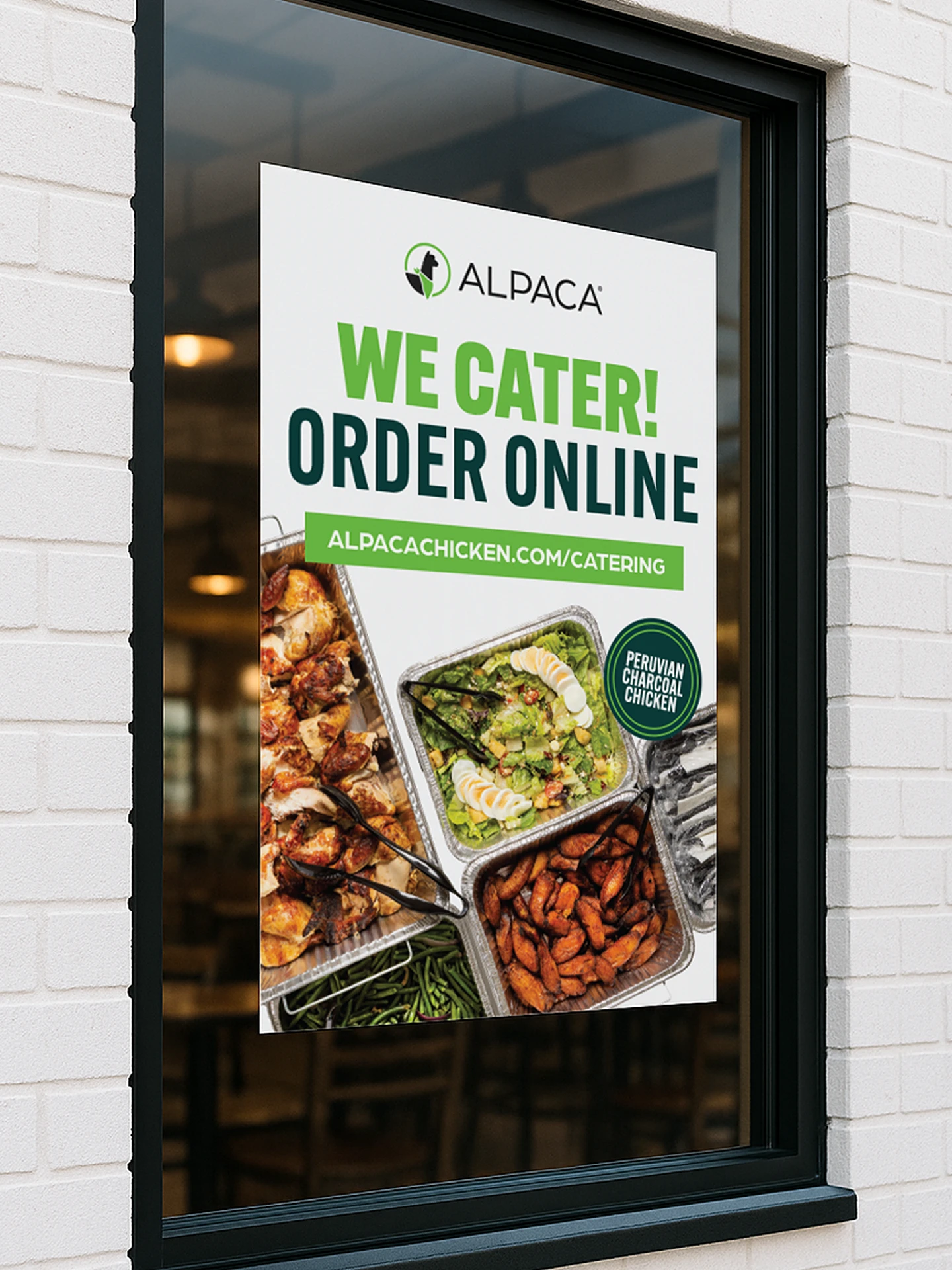
Alpaca Chicken had the opposite challenge. They had a brand people recognized and loved across multiple locations. But as licensee requests started coming in and the goal shifted to 50 locations, the question changed. It was no longer just whether the brand looked good. It was whether it could travel, whether it could be handed to an operator in a new market and still feel like Alpaca.
Both are brand strategy problems, not design problems. A brand without a system has no center of gravity. Every new touchpoint becomes a judgment call. Every new vendor, every new location, every new hire adds a little more drift. Over time, the brand stops communicating anything coherent and starts communicating chaos.
For a single location operator, this is manageable. For anyone with growth ambitions, it becomes a liability that compounds with every decision made without a foundation to build from.
What Does a Scalable Brand Actually Include?
When people picture a brand, they picture a logo. A scalable brand is the other ninety percent nobody thinks about until it is missing. It starts in discovery, the deep dig into a brand’s DNA that surfaces what it stands for, who it is for, and how it should show up in the world. That foundation is where brand and creative strategy take shape, and from there it gets built into a system every operator, vendor, and platform can actually use. Here is what that system includes, and why each piece earns its keep the moment you grow.
A Logo System, Not a Logo
One mark is a liability. A system gives you the right version for every situation. When we refreshed Two Roosters, we did not hand them a logo. We handed them a suite: a primary script for packaging and storefront signage, a flat secondary version built for website headers and scrolling banners, a bold throwback mark that holds up on the back of a pint or stitched onto a hat, and alternate marks meant to live as graphics on merch. Every application has a version designed for it, so nobody is ever squishing the wrong file into the wrong space.
A Color Palette That Works Everywhere It Lands
A real palette is engineered for production, not just for a screen. Two Roosters’ teal, cherry red, vanilla, and black are each specified three ways: Pantone for professional printing, CMYK for everyday printing, and HEX for web and digital. That is the difference between a color that looks right on the website, on a printed cup, embroidered on a corduroy cap, and screened across a truck, and a color that drifts a little more off-brand at every stop.
Typography That Travels
Your brand fonts need to work in every application, from a billboard to an Instagram story to a menu printed by a local vendor. Cook’s specifically called out the need for fonts that were versatile in all caps and standard case, accounted for punctuation and numbers, and stayed legible at any size. That kind of foresight is exactly what separates a font choice from a type system.
A Voice and Messaging Framework Any Operator Can Pick Up and Run With
Everything to this point is how the brand looks. But looking the part is only half of it. The voice and messaging framework is the foundation the visuals are built on and the story they are meant to tell. It includes the full verbal identity: a mission, a positioning statement, a brand story, core values, and a deep bench of taglines that all sound like they come from one company. With that in place, a new manager or social coordinator is not guessing at the tone. The framework hands it to them.
Brand Guidelines Tight Enough to Enforce, Loose Enough to Live
Good guidelines do two jobs at once. They lock down the things that must stay consistent, what not to do to the logo, which color pairings to avoid, how the type should and should not be set, while leaving room for the brand to play through illustration, flexible layouts, and mockups that show the system stretching into new applications. Consistency where it counts, personality where it breathes.
The Digital Experience
The storefront looks great, the packaging is sharp, and then the website feels like a different company built it. Off colors, a logo squished to fit, online ordering bolted on with no brand in sight. Your website is a location. For a lot of people, it is the first one they ever visit, and increasingly it is where the actual transaction happens. Whether your digital stack is a custom-built site paired with a loyalty platform like Paytronix, or you are running on Toast, PopMenu, or Square, the brand has to hold. The same identity that lives on your signage and packaging has to show up on an Instagram story and a checkout button. A scalable brand is designed with that in mind from the start.
What Does It Look Like in the Real World?
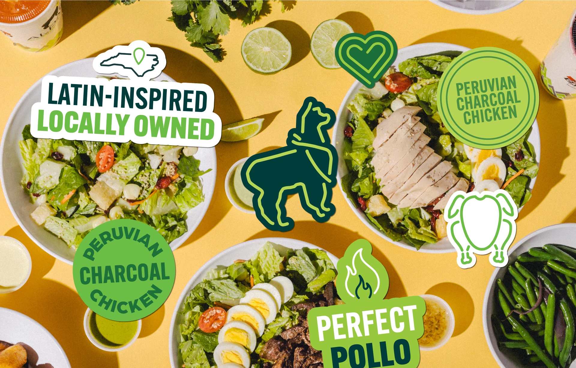
Alpaca Peruvian Chicken is one of the clearest examples we have of what it looks like to build a brand system while the business is already in motion.
Alpaca did
not come to MRC with a broken brand. They came with a beloved one that had outgrown itself. Across locations, different generations of the logo had taken root. Signage varied from store to store. The mark itself had legibility issues, and the yellow-and-green palette, iconic as it was, had real ADA contrast issues that no one had formally addressed. Promotional materials were inconsistent across the portfolio. The brand was not falling apart, but it was not holding together either, and with a licensee model pushing toward 50 locations, that gap was about to get a lot more expensive.
When they came to us, they thought they needed social assets and campaigns. We saw that the foundation had to come first. A flag in the ground before anything else. Tighten the brand, fix the website, establish clear guardrails for what to do and what not to do, and then the campaigns would actually have something to stand on. You cannot market your way out of an inconsistent brand identity. You just spend more money making the inconsistency more visible.
The challenge with a licensee model is not just consistency. It is control without friction. A licensee operator is not waiting for a designer to approve every asset. They are running a restaurant. They need a brand system that makes the right decision the easy decision, at every touchpoint, without a call to corporate every time a sign needs to go up.
That meant more than a logo refresh. We did a full placemaking audit across the store environment, identifying where the logo actually needed to appear, what could be evergreen and stay up through any campaign, and what was worth the cost of swapping out seasonally. The result was a clear asset hierarchy that saved money and created cleaner, more intentional spaces.
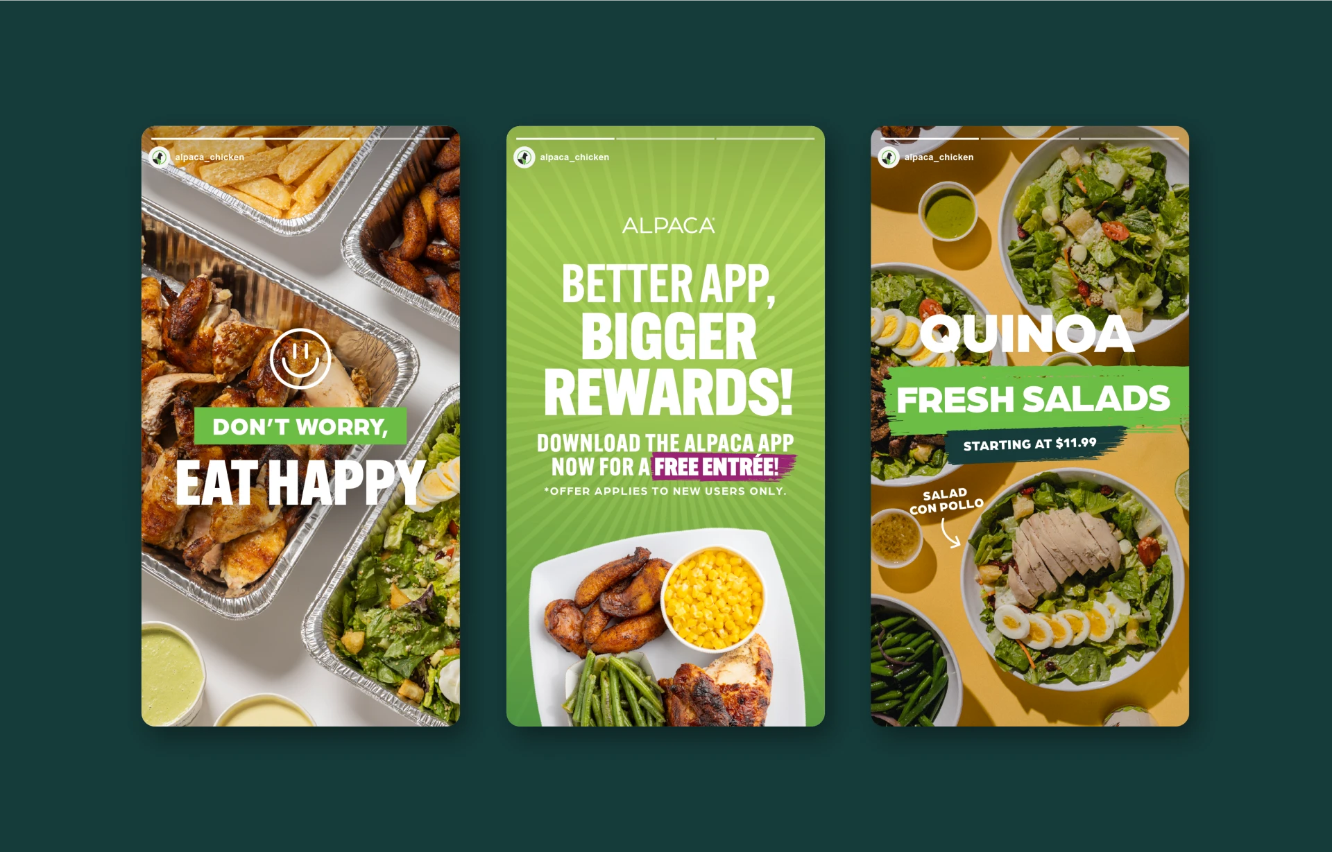
The bigger shift was operational. Alpaca now has a brand portal where general managers pull directly from a library of corporate-approved assets. Nobody is guessing. Nobody is pulling an old file off a hard drive or screenshotting something off Instagram. As they build toward their 20th location this year, every new store opens with the same brand as the flagship.
“Since working with them, we have seen increased sales, customer engagement, and brand recognition. As much stuff as we throw at them, they always deliver.”
— Nicole Pasca, Marketing Manager, Alpaca Chicken
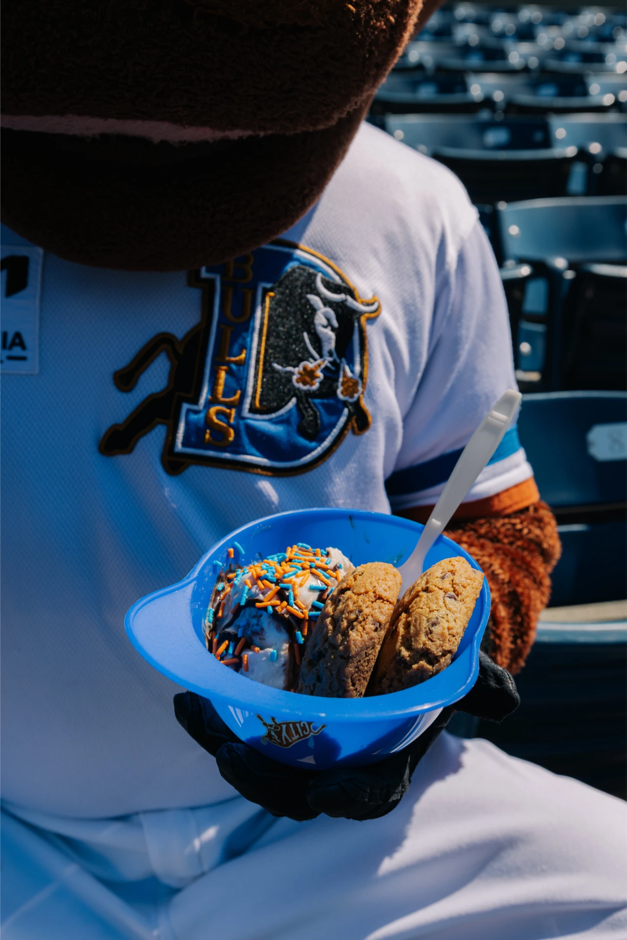
We are still in it with them. Today, that looks like helping shape operational strategy and a new location guide that gives incoming store managers a clear playbook from day one. We built out templated assets for the things managers handle themselves, business cards, email signatures, the everyday stuff, so they are not waiting on a designer for every small request. On the brand side, we continue to support sports partnership creative for the Carolina Hurricanes and Durham Bulls, ongoing web maintenance, app promotions, and design strategy as the brand continues to grow.
When a brand is built as a system, the partnership does not end at launch. It just shifts into a different gear.
What Should You Ask Before You Scale?
Most brand conversations start in the wrong place. Operators come in talking about colors they like or logos they are tired of. The questions that actually matter are operational, and they reveal whether a brand is ready to grow.
Is your logo doing too much? A mark that tries to carry the full name, a tagline, an icon, and a descriptor all at once works fine on a large sign and falls apart everywhere else. Too horizontal for digital. Too complicated for a to-go cup. Too small to read on a hat. A scalable logo is engineered for reduction, with a version ready for every size it will ever live at.
Does your tagline actually travel? Or is it creating confusion when it stands alone? More than once, we have walked into discovery conversations where customers thought the tagline was the restaurant’s name. If your slogan is not building equity, it may not need to be in every application of the logo. Knowing when to use it and when to leave it off is part of having a real system.
Does your brand need a mascot to sell the experience? Sometimes an illustrated character is a genuine brand asset that compounds in value across merchandise, signage, and campaigns. Sometimes it is the decoration that complicates production and adds cost without adding clarity. The question is not whether a mascot is fun. It is whether it is doing real work.
Do you actually know who your customer is? The answer cannot just be everyone. A brand that tries to speak to everyone ends up resonating with no one, and the gap between who you think your customer is and who is actually walking through the door shows up in every marketing decision you make.
Does your brand tell a story visitors can see and feel? The charm that exists inside your location, in the staff, the atmosphere, the details, has to make it onto your printed materials, your packaging, your digital presence. If what you are handing someone on their way out does not feel like the same place they just left, that is a brand problem.
Can a vendor in another city reproduce your brand accurately without you in the room? If the answer involves sending a PDF and hoping for the best, that is a gap. A real brand system gives any printer, sign maker, or embroiderer exactly what they need to get it right the first time.
Do your restaurant brand guidelines exist, and are they actually usable? Guidelines only work when the people running your locations can open them, understand them, and make decisions from them without calling anyone. A document nobody references is not a system. It is a file.
Does your brand have a point of view that will still feel true in five years? Trends are expensive. A brand built around what is popular right now will need a refresh before your third location opens. The brands that travel are the ones built around something true about who they are.
The operators who ask these questions before they scale are the ones who do not have to answer for them later. A brand that can say yes to all of them is ready to grow. Most cannot, and that is where we come in. The logo system, the messaging framework, the guidelines, the digital experience, none of it is decoration. It is the Food & Beverage brand identity work that enables growth. It is the foundation. And building it right before location two is exactly what we do.
Building something meant to grow? Let us talk about what your brand needs before location two.